6 Day Kitchen Reno // Design Plan
JULIA AND GARRETT'S KITCHEN Well the #6daykitchenreno is done and we're back at the farmhouse recuperating after a whole lot of late nights working at Julia and Garrett's house. Over the past week, I shared the renovation in real time on Instagram, but since I have a little more free time now, I'm going to share the entire project, detail by detail, here on the Grit and Polish. If you're one of those people who reads the last page of a book before getting started, hop on over to Instagram to see a sneak peek of the finished space. But if you can hold out, I promise to reveal the entire kitchen next week (ish) here on the blog.
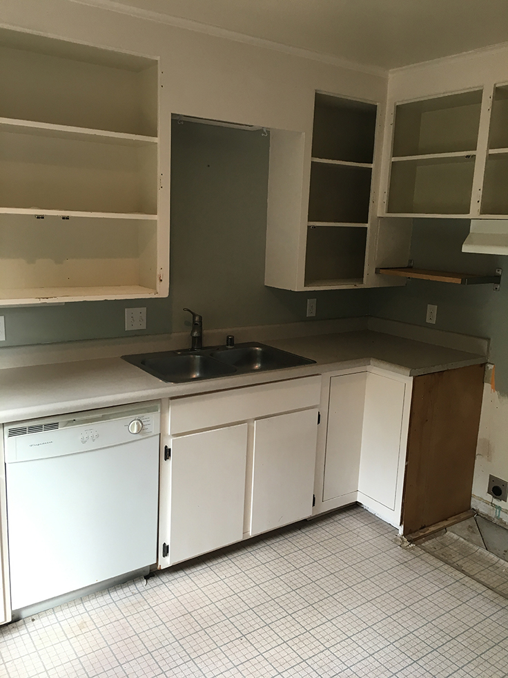
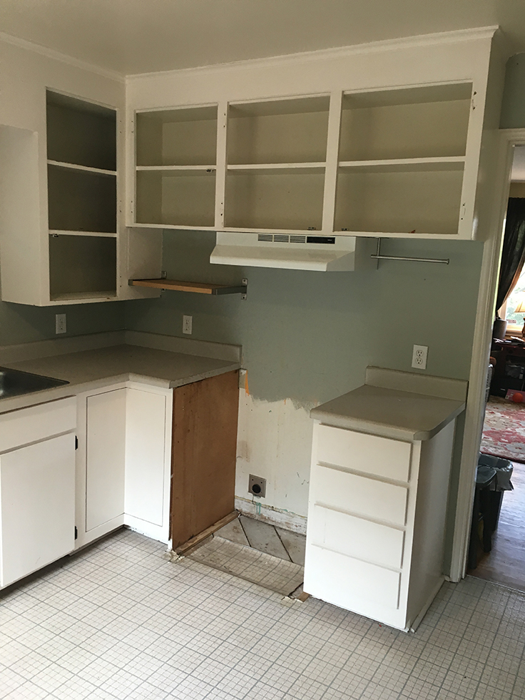
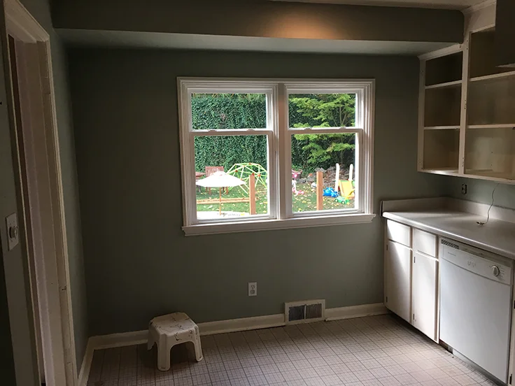
Julia and Garrett's #6daykitchenreno actually took us 7 days to complete. Seven looonnnnggg days. What can I say, some things just can't be rushed. Especially if you don't want to cut any corners. One thing that actually helped the project stay on track, was having the homeowners demo the existing kitchen before we arrived. Julia and Garrett tackled all the demo in one day while their kiddos went to the zoo with grandma. Here's what the kitchen looked like as they prepped for demo:
the-grit-and-polish-6-day-kitchen-before-1
the-grit-and-polish-6-day-kitchen-before-3
Julia and Garrett's kitchen was original to their 1940's home, measuring only 10'x10'. With a staircase behind one wall of the kitchen and a fireplace behind another, we were unable to enlarge the kitchen or open up any walls for better flow. So we made due with the existing layout. We were, however, able to add a pair of french doors where the south facing windows originally stood, bringing more natural light into the space and improving access to Julia and Garrett's amazing backyard.
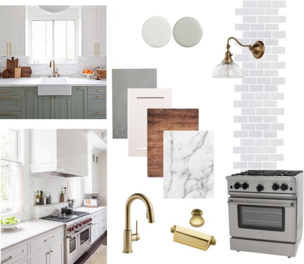
I worked on the design plan with Julia and Garrett earlier in the summer. They wanted a traditional kitchen that would feel like it belonged in their 1940s home but were hesitant to incorporate anything too trendy into the design for fear it would look dated in only a few years. Julia and I have similar tastes in kitchens (and for men named Garrett, apparently) so that made this kitchen extra fun to collaborate on. After a little Pinterest research, I put together three design schemes for the homeowners to pick from:
Option 1
Option 1 wraps a little modern country into a traditional design. I suggested two-tone cabinets (white on top and gray on the bottom), brass hardware and open wood shelves to warm up the design. Julia didn't like the apron-front sink and she was worried that two-tone cabinets would date too quickly, so I came up with a second design option.
Option 2
Option 2 has a lot of the same components as Option 1 (shaker cabinets, large-format gray tile floors, subway backsplash, brass faucet and hardware, stainless steel appliances) but it's all-white. I also removed the wood from the design and switched out the hardware for long pulls from Etsy.
Option 3
Lastly I did a budget option, which utilized Julia and Garrett's existing cabinets and paired inexpensive butcher block with the same large-format stone floors. I brought back the less-expensive cabinet hardware by Martha Stewart into this design as well.
After some back and forth, Julia and Garrett went for Option 1 with a few modifications. First, I really wanted to build in a hood vent and tile it (similar to the one shown in Option 1) but it was nixed because it added time and money to the design and just wasn't a priority for the homeowners. We also switched out the lower cabinet color to navy when Julia decided she was up for a bolder color combination (yay!). Lastly, we switched out the stone floors for 2 1/4" pre-finished red oak floors because the stone just felt kinda flat when we laid it out in place. The cabinet paint and the floors were game-day decisions which was a big reason why this 6 day kitchen reno bled into day 7. But I'm so thankful we made the swaps because the end result is stunning!
Stay tuned next week for more on the construction process and a look at how we built this kitchen in such a short amount of time.
Resources: sconce, Rejuvenation | stove, Bluestar | cabinet pull, Martha Stewart | cabinet knob, Martha Stewart | faucet, Delta | tiles, Home Depot | ceiling light, Rejuvenation | floor tile, Home Depot | bar pulls, Etsy | Option 1 top kitchen, Option 1 bottom kitchen, Option 2 bottom kitchen, Option 3 top kitchen, Option 3 bottom kitchen
xoxo
-Cathy
p.s. this is one of the most impactful articles that I've read in a long time. It's all about food and respect and not wasting. It's all of our responsibility. Also: take your damn leftovers.
p.p.s. here are a few of my current favorite kitchens on Pinterest: black and white, green office kitchen, rustic, and wood and white.
p.p.p.s. Love these hanging pots in Julia's kitchen. I'm definitely going to need some of these!


