Porch House // the Floor plan Before and After Renovation
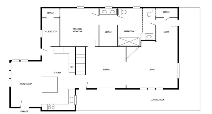
THE PORCH HOUSE I've gotten a few question about the Porch House floor plan lately, especially where the mudroom sits in relation to the kitchen. So today I wanted to show you guys how this house is laid out. I'll be focusing on the first floor, because the second floor - which houses 3 bedrooms, a bathroom, and a sun porch - required such few changes to the layout that we didn't draw plans.
Here's what the first level floorplan looked like when we bought the house. I imagine it's similar to what the home looked like in 1900 although there were some additions later on (like the sunroom and attached garage).
And here's what the layout looks now:
UPDATE: a few readers caught an error in the dining room on the AFTER plan. We didn't take out the original window. I've fixed the floor plan to reflect reality.
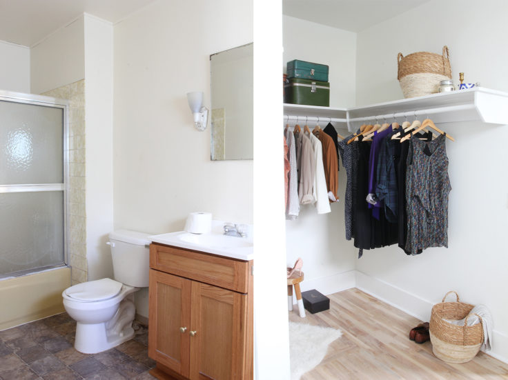
We made quite a few changes to the floor plan. First, to create a master suite on the main floor, we divided the front bedroom into a master bathroom (you can see more about that space here) and a brand new powder bathroom. What was once a kids bedroom is now a large en-suite bathroom with heated floors plus a quaint powder bathroom, accessed off of the entry. Here's the view of what's now the master bathroom, pre and post renovation.
rug / bench / turkish towel (similar) / art (except vintage and bird postcard) / basket (similar) / slate tile
The original main floor bathroom was previously a jack-and-jill bathroom between the bedrooms, and is now the master closet.
The other major changes to the floor plan came at the back of the house, near the kitchen. We removed the wall between the old storage room and the kitchen, making for a more modern/open-concept layout. It was easily the biggest layout change we made to this house, and easily the single best thing we did during the remodel.
rug / pillow (similar color) /
We also closed off the original door of the master bedroom's tiny closet and moved it to the mudroom. This added some much needed storage by the back door. Finding original wood shiplap behind wallpaper in the closet was just a cherry on top.
Updating an old home's floor plan to modernize it and make it more efficient is probably my favorite part of renovating. Well that and kitchens. I see layout changes - whether it's opening up the kitchen, improving flow, or adding a master suite - as an essential part of ushering these old homes into the new century.
Next up, I'll be sharing more on the mudroom! Any thoughts about our layout changes?
xoxo
-Cathy


