The Farmhouse // Daphne's Nursery: Design Plan (ORC Wk 2)
THE FARMHOUSE This is post 2 of our Spring 2018 One Room Challenge makeover of Daphne's bedroom. You can catch up on the rest of the series here: inspiration/before, design. Thanks for following along!
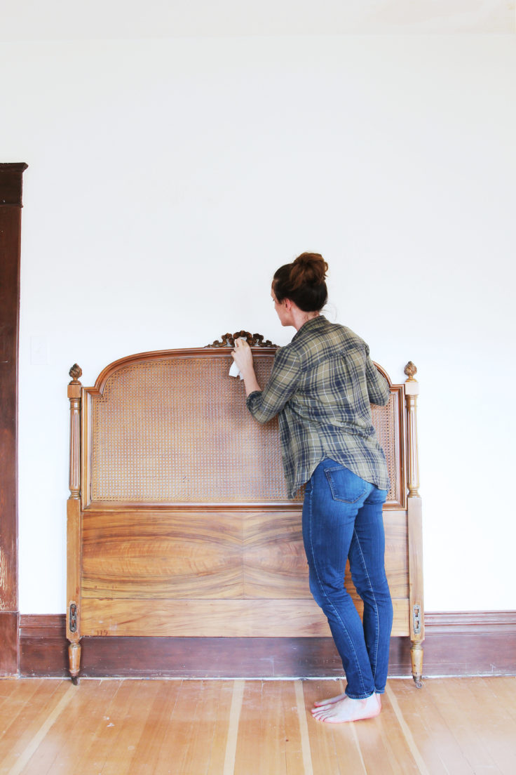
Sometimes rooms come together super easy and quick and sometimes they just don't. Daphne's nursery has been the latter for me. I've been thinking about this space for the better part of a year now - both the function and the design - but nothing was clicking. Rather than push it, I decided to put the room on hold, collect a few baby things (how could I not?!), and wait for inspiration to strike. Wouldn't you know it, all it took was finding a FREE cane bed frame on Craigslist for everything to fall into place.
Of course this old beauty is not without its issues. A platform must be built between the rails to hold a foam mattress. And the shiny finish and in-between wood tone looks all wrong in person, so we are thinking about painting the bed. Or trying a wax treatment. Or...I don't know...something! I asked folks on Instagram yesterday what they would do, and 300+ comments later, I'm no further along in deciding but I did get some great suggestions! Thankfully we did at least make some other decisions this week.
Design elements
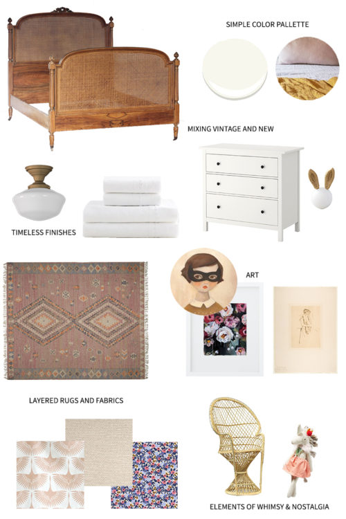
Now that this full-size bed is anchoring the room, I literally can't stop coming up with ideas. Ha! I've settled on a feminine and nostalgic nursery design that feels completely at home in a 1912 country Farmhouse. I want it to be youthful and layered but still timeless and historic. Like a fresh summer breeze. And of course there will be a healthy dose of pink and whimsy! Here's the plan:
sources: paint color: BM Simply White / ceiling light / sheet set / dresser / bunny knob / rug / art: masked girl print, flowers painting, baby's back print / fabric: velvet birds, linen, floral (navy) / vintage kids peacock chair (similar) / unicorn
There are other finishes for this room too - like say, a crib - but the mood board gives you an overall feel for the finished space. A couple of the design elements you can't see include layered textures to create interest for little fingers. And all-natural materials such as cotton, wood, and wool.
We made some physical progress in here too. Holes were patched, the ceiling was repaired from a leak last winter (I'll share more on this next week), and now we're ready to get busy on some DIY projects.
DIY Projects
Like always, we have quite a few hands-on projects lined up for this room. BUT, these DIYs are a little different from our usual construction projects.
One // build our own large, antique-inspired wood frames
Two // curtains! I'll be dying and hemming some drapes we have on hand. Plus I'm going to try my hand at sewing a roman shade (or something similar) for the crib nook
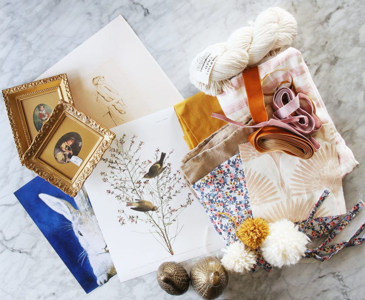
Three // Updating old throw pillows with poms (made out of merino and alpaca wool for added texture) and possibly sewing a new pillow or two
Four // hanging large art with velvet ribbon
Five // the bed frame! We're going to update this beauty with a platform for a modern foam mattress. And we need to address that finish...
For the record I can't sew, at least not really. I have a sewing machine - a hand-me-down from my mom - but haven't made a stitch in a decade. Hopefully it's like riding a bike...
Video Update
We have a lot still to tackle in the next four weeks. But before we get busy, I wanted to share a video and the floor plan. It can be hard to share the feel of a room in text and photos, so hopefully this video can do more...
https://youtu.be/ftw0uZB5W60
We're trying to create more video content, so let me know your thoughts on that video!
Floor Plan
I talked a lot about the floor pan in the video, so I suppose I should share that too ;) I actually love seeing rooms in plan view (it's the structural engineer in me). It can put everything in perspective, you know? Once we finalize the furniture placement - which will be later after we put the major pieces back in - we'll add that into the plan too. For the time being, here's the empty floor plan for Daphne's room:
I sure do love this space and can't wait to share all the physical progress we've made next week! Thanks for following along, and you can check out all the other designers' weekly updates here.


