The Farmhouse // Daphne's Nursery: Repairs, Trim, and More (ORC wk 3)
This is post 3 of our Spring 2018 One Room Challenge makeover of Daphne's bedroom. You can catch up on the rest of the series here: inspiration/before, design, repairs. Thanks for following along! Somehow we're already on week 3 of the One Room Challenge and I'm feeling a wee bit behind. Honestly, I'm still waiting on some materials but am chomping at the bit to get started on those DIYs I outlined last week. Pretty sure this room is going to be a mad dash at the end, but like all good house projects, it will get finished. Eventually ;)
Paint and Trim
Although Daphne's room was in good shape when we started this One Room Challenge, we did have to do some repair work. A couple weeks ago, I had Garrett remove the book ledges to make room for Daphne's dresser, which meant patching a few holes in the plaster and scraping caulk lines. Of course holes and scraping can quickly turn into larger holes and more scraping and in the end we had a fair bit of patching to do. Old houses, you know?
We also did some ceiling repair from a leak (evident in the top left of the photo above). I'm not sure leak is quite the right word, but last winter we got a ton of snow and cold temperatures and an ice dam formed, causing moisture to penetrate the roof, drip through the attic, and damage the ceiling. Ugh. And before you ask, yes we called our home insurance to see if this was one of those Chris-Loves-Julia-Got-A-Free-Roof deals, but alas, it was not. So we repaired the damaged areas and will see if there's anything to be done with the roof later this year. In the mean time, this room got fresh primer and paint on the ceilings.
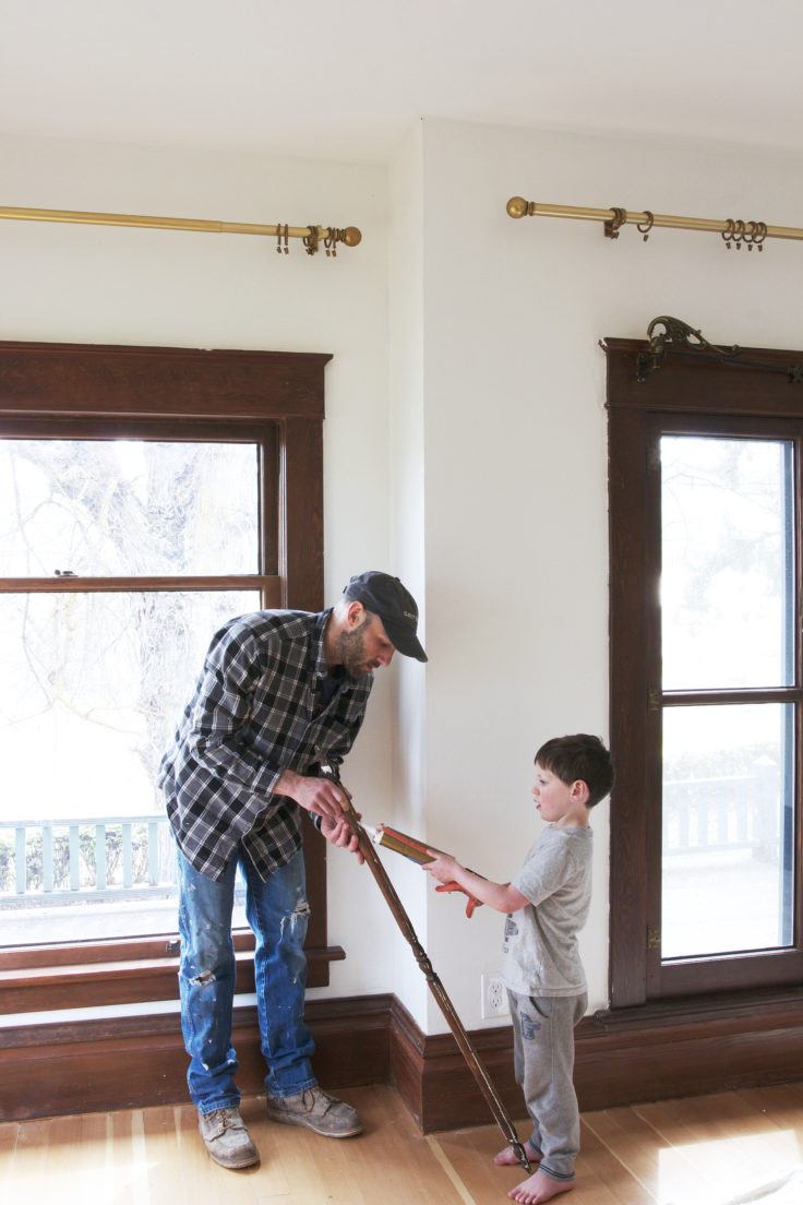
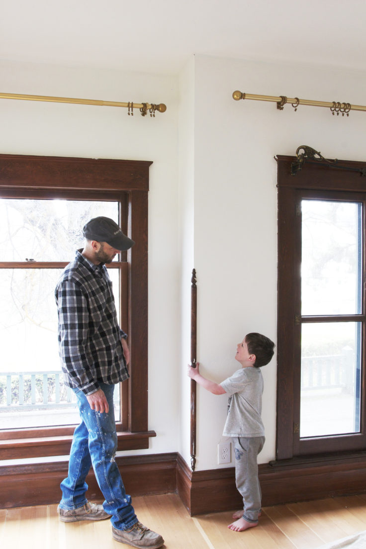
Before this room is done, we need to install base shoe. That's one of those tasks we never quite get to until the 11th hour, or the One Room Challenge comes around ;) One molding item we did get to was installing the cool interior corner pieces (I call them plaster corners, but I'm not sure the technical term). These were removed when we originally painted the room a year plus ago. Somehow these beautifies didn't make it back on the walls at the time but we finally installed them yesterday!
Design Question
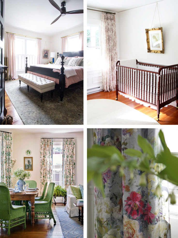
Before I leave you, I wanted to get your opinion on one major design struggle I'm having in this space: the curtains. There are 3 large windows in Daphne's nursery so the window treatments will play a dominate roll in the look and feel of the room. Last week I mentioned my plan to dye some IKEA curtain panels that I already own, hem them, and add pleating tape to create a more formal look. While I'll likely still do that, I spent entirely too much time online last week sourcing other curtains and fabric options. Basically it comes down to FOMO. Would simple pink curtains mean me missing out on my one girly opportunity for something more? Like a toile or a larger floral pattern?
Here are four images making my curtain debate that much harder:
Clockwise from top left: Making it Lovely // A Country Farmhouse // unknown // Sarah Bartholomew's Home via the Glam Pad
Any thoughts on the curtains? Of course the DIY option is pretty much free so it's hard (impossible?) to justify spending $400-$1000+ on 6 curtain panels. But don't those prints leave you with a little FOMO?!
Can't wait to share more progress next week. In the meantime, catch all the other designer's rooms here.


