If you Let Your Husband Pick Out the Kitchen Faucet...
THE RAVENNA HOUSE Last month I told Garrett that he could pick out the kitchen faucet for the Ravenna House. Why? I'm not really sure. But I think it was a combination of frustration (he didn't like anything I picked out) and a little bit of ego (I said something like, "fine! let's see if you can do any better").
Well turns out, if you let your husband pick out the kitchen faucet, this is what you get:
Yup, that's a commercial faucet in my kitchen. It's chrome. It's huge. And here's the crazy part. I actually like it. I might even go so far as to say I really like it. Surprised? Me too. Here's why. The faucet is super functional. You can fill tall pots with the spout and reach the entire sink with the high-pressure sprayer. I like the way the height of the faucet highlights the window molding and the gray handle complements the marble backsplash. I don't even mind that it's chrome despite the fact that everything else in the kitchen in brushed nickel or stainless steel.
Oh and there's the apron front sink. As you may remember, I had designed the sink-base cabinet around the Ikea Domsjo (here), only to find out that it was out of stock. A last minute Amazon search found us a replacement (here). The new sink is shorter and not as wide as the Domsjo, which meant Hubby had to do some tweaking to the cabinet. He added filler strips along the bottom and sides of the notch out and then we painted them. You can hardly tell. Hubby does good work!
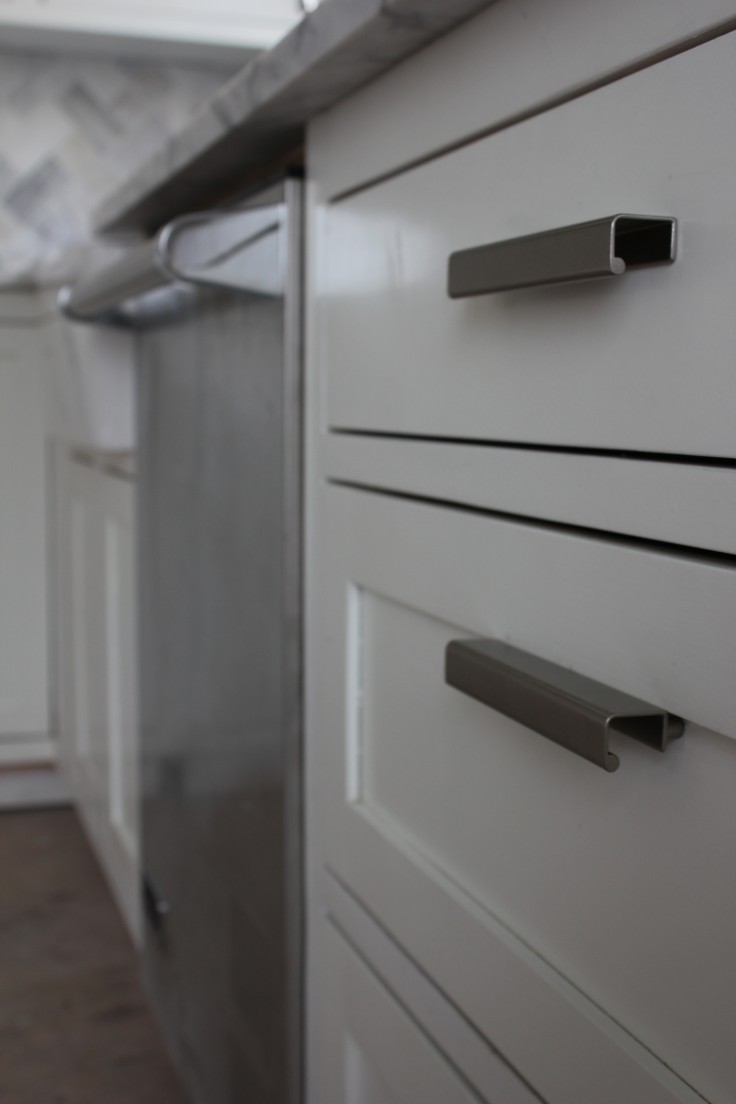
While we're talking kitchen details, let's talk cabinet hardware. This was one of those game time decisions for me. I ordered a couple of different styles from Home Depot and then tried them out last weekend after the cabinet faces and drawers were installed. My favorite were by Martha Stewart - boxy pulls for the drawers and classic matchbox catches for the cabinets (we used the same catches in chrome at the Bryant House).
I like the mix of the modern pulls with the classic catches. The pulls help tone down the overall traditional-ness of the kitchen. See I'm one of those people that doesn't like anything to feel too perfect. I like spaces to feel lived-in and have a touch of the unexpected. I'm the kind of person that likes to mix black and brown and leave unfolded throws on the back of the couch. So for me, the juxtapose between the traditional matchbox catches and the modern pulls (and the commercial faucet for that matter) creates balance. One could even say, a little conflict is a good thing. At least in kitchen design.
I'm really pleased with how the kitchen is turning out. So much so, in fact, that I'm sensing another round of "If you let your Husband Pick..." coming soon!
What do you think? I'd love to hear from you!
xoxo
p.s. did you notice that we grouted? I am LOVING the backsplash...femininity be damned.
p.p.s. This is a great blog post about what some people feed their baby's (hint: pretty much anything).
p.p.p.s. Happy happy happy birthday Sissy! And though we may be a good number of years away from 40, this article has some great tips on aging!


