Our Tuxedo Kitchen Plan
THE DEXTER HOUSE We've owned the Dexter House for 4 months now, and I've thought about the kitchen pretty much every single day of those 4 months. I've gone back and forth on what I want this space to look like but finally settled on a non-white, warm European feel.
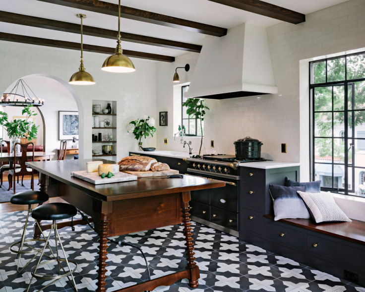
I've also decided to keep the color palette simple: black, white, and wood with accents of chrome. I've heard this black and white design called a tuxedo kitchen before, and while I don't know if that is the technical term for this two-toned style, I'm going with it.
So I'm here to officially tell you that the Dexter House will have a tuxedo kitchen! Really, I'm hoping that the simple colors will keep the space feeling elegant and expensive-looking, while still being budget-friendly and cozy. It is a lot to ask, I know, but I'm feeling confident that our kitchen will deliver...kinda like this Jessica Helgerson tuxedo kitchen:
Admittedly, this beautiful kitchen was likely not budget-friendly, but it gives you sense of the style I'm going for. (Do you remember I showed you this kitchen back in 2014 after falling in love with it?!) You may also have noticed that it has a distinct Spanish flair. Well since the Dexter House exterior was designed in a Spanish architectural style, I'm trying to bring that look inside the house, or at least give a nod to it. Hence the cement tiles and white walls.
Here's a look at the materials that are on my shopping list for the Dexter House:
Resources: Sink, NBI Drainboard Sinks | Faucet, Wayfair | Pot Filler, Signature Hardware | Swingarm Lights, Rejuvenation | Pendant, Rejuvenation | Brackets, Etsy | Butcher Block, Hardwood Industries | Oak shelves, Hardwood Industries | Blue Star Range, Albert Lee Appliance | Cement Tile, Overstock | Towel, One Kings Lane |Hanging Pot, One Kings Lane | Onyx black paint, Benjamin Moore
I know what you may be thinking: the color palette feels a bit stark. And I agree. But my philosophy on kitchen design has always been to keep it simple. Both the design and the color palette of a kitchen should be clean and easy to live with. Kitchens end up so busy with traffic and clutter - like fruit bowls, dishes, cookbooks, and toy dinosaurs (if you happen to have a 2 year-old) - that adhering to a simple design will help the space to feel more organized and less cluttered when every day life enters the space. Make sense?
Okay, so that's what will be going into our kitchen. Thoughts?
xoxo
-Cathy


