Porch House // A Beautiful and Budget-Friendly Powder Bathroom
THE PORCH HOUSE
This is part 4 of our Porch House powder bath series. You can read more here: design, why we added a powder bathroom, 8 great wallpapers, budget (it’s crazy how little this room cost!).
Today's the day I get to show you the finished Porch House powder bathroom! This room is one of my all time favorite renovations we've done, but before we get into it let's take a look back at where we came from.
the ‘before’
A true 'before' is tough for this space since this is a brand new bathroom, carved out from 34sf of an old bedroom. You can see how we altered the original floor plan to gain this powder bathroom here.
Design inspiration
The old bedroom had one window, which we left on the other side of the wall (in the space we converted into the master bathroom), leaving this powder bathroom with zero natural light. With such a dark, small room on my hands, I was excited to create a jewel box of a space within this simple, historic home. And after many months of work, I'm happy to say this bathroom is just that: a beautiful jewel box.
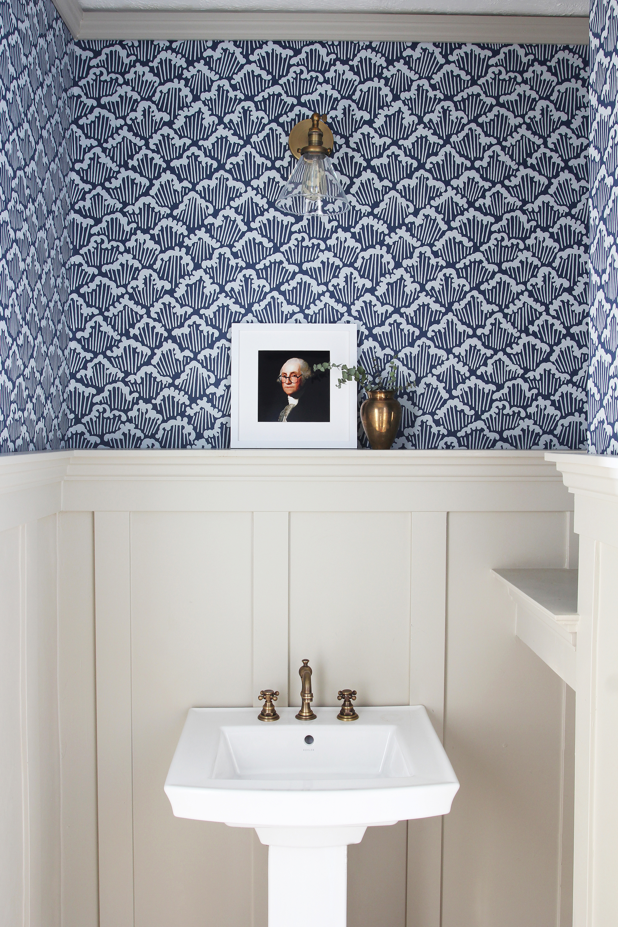
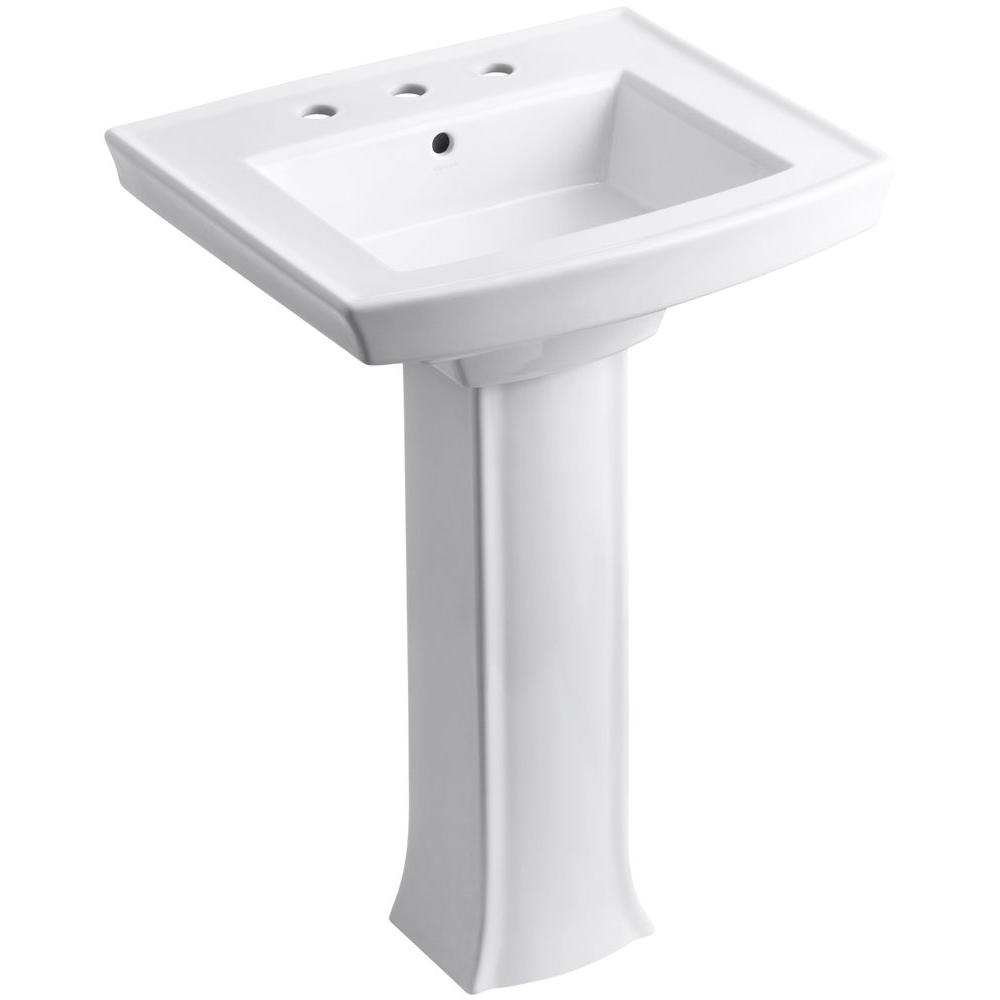
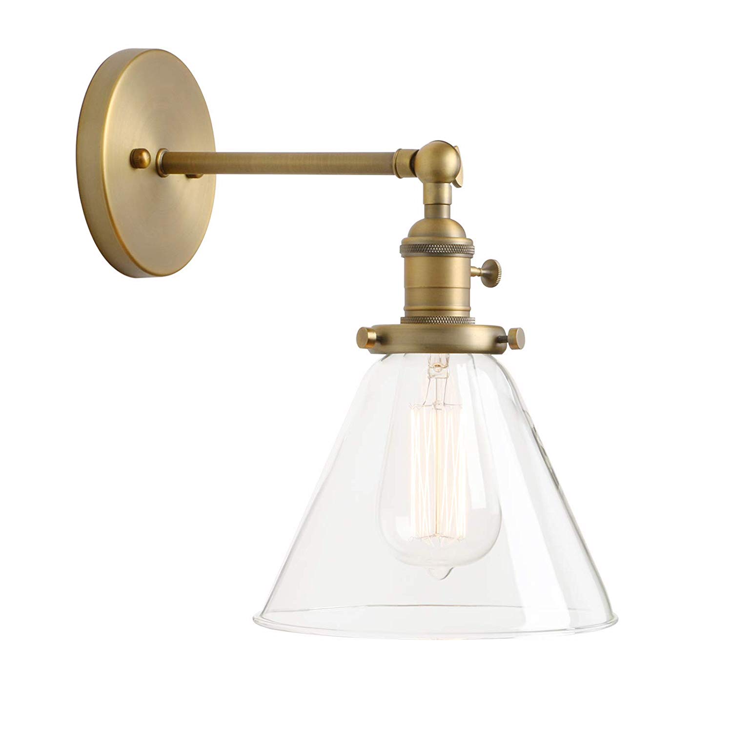
We stuck with classic finishes in here: board and batten painted in C2 Vex (the same color as the kitchen cabinets), beautiful wallpaper (but only 2 rolls...because hello budget), a brass faucet, delicate sconce, and a simple white pedestal sink. And believe it or not, this renovation was completed on a tight budget, which I'll share next week.
Why no mirror…?
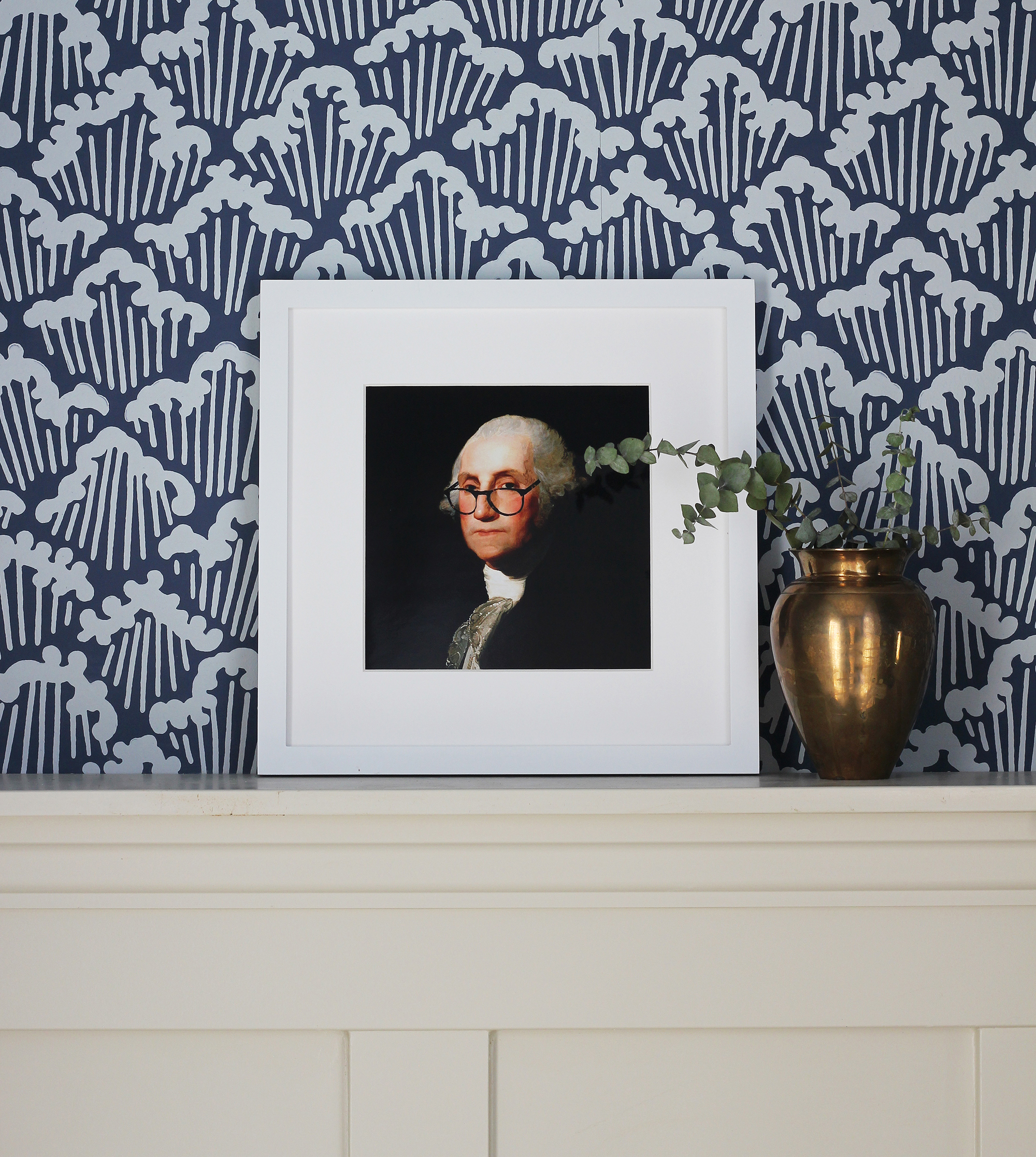
Let's address the biggest issue with this room: the lack of mirror above the sink. Goodness did we try to put one there! But that ledge at the top of the board and batten is 5' high and 10" deep (the lower wall is that thick to house plumbing) making mirror placement super difficult. My mother-in-law ended up setting a stand mirror on the adjacent shelf, which works perfectly, and then I propped this whimsical George Washington print above the sink.
I kinda love that George Washington is silently watching you (through Warby Parker lenses) like he's appraising your hand washing abilities and not-so-secretly judging you. Nothing like a little whimsy to keep a room from feeling too serious. By the way, this print is a free download from Melissa, and I printed it at Costco for a couple bucks and framed it in an inexpensive Target frame. Budget art at it's best!
our one big splurge: wallpaper
I can't say enough good things about our big splurge in this bathroom: the wallpaper from Farrow and Ball. It's textured and thick and beautifully colored and everyone who has seen it has loved it. Although I have to admit wallpaper install is tough. Garrett and I decided to tackle this wallpaper one night at about 10pm because the boys were at Nana's so why not?! Famous last words. I was cursing that decision all the way until 2am, when we called it quits at about half way done. I'm certain that I swore we'd never wallpaper again, but alas, it's too darn pretty to make that kind of promise.
the floorpan
This photo above shows the view from the bathroom door, which is just off of the front entry (see the floor plan here). It’s a little awkward to have a bathroom viewable from the front door, but thankfully the toilet is tucked back behind the door and still feels private.
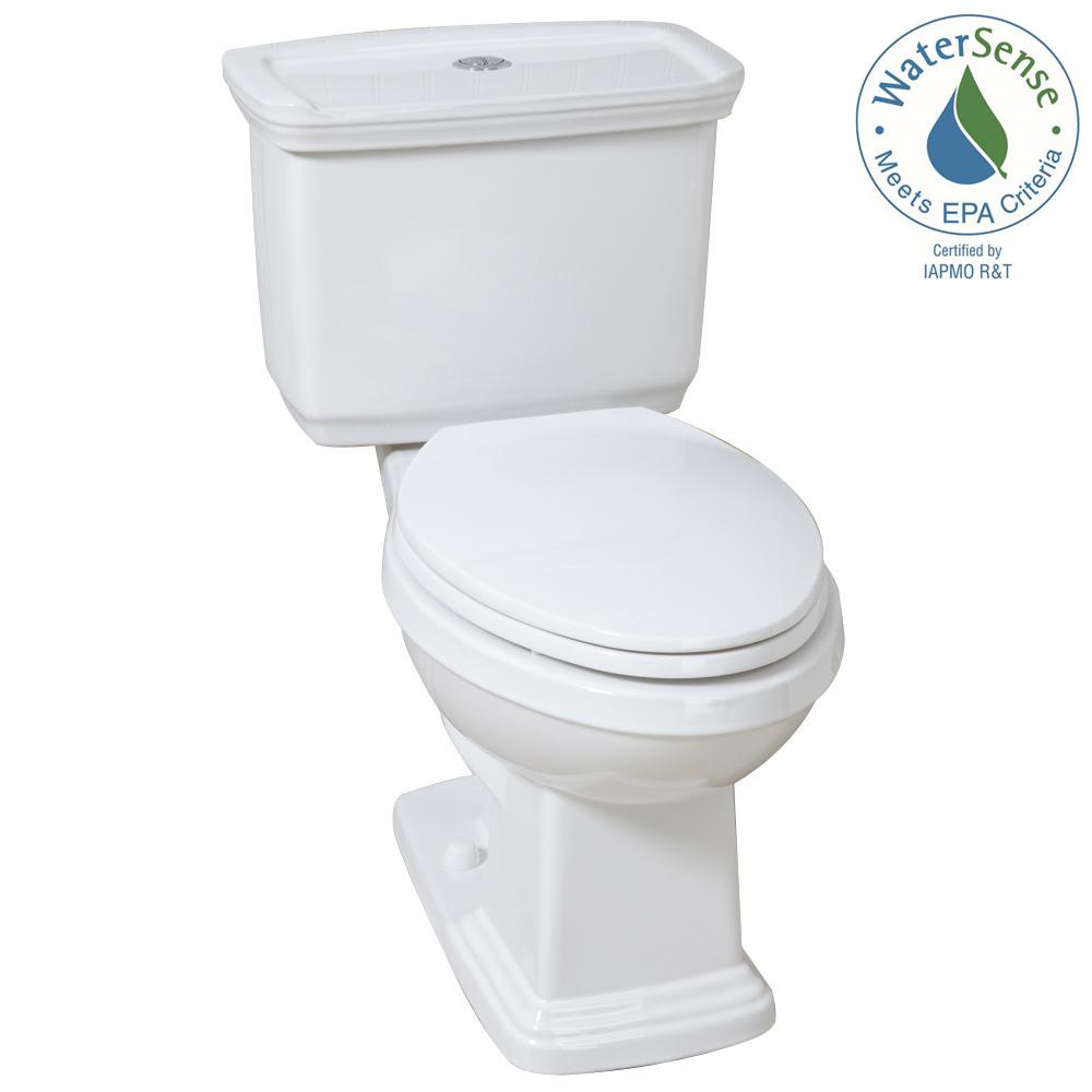
The toilet is located across from the sink in this rectangular-shaped room. And we placed a cabinet (original to the house, but from a different room) above it for some storage. Excuse the odd angles of these photographs - this small, window-less bathroom was hard to shoot!
Goodness, I really do love this room! But we'd love to hear what you think. Would you ever do dark wallpaper like this in a window-less room?


