Tacoma Converted Garage // Moody Kitchen: Reveal (ORC, Week 6)
psst: sources are at the bottom of this post
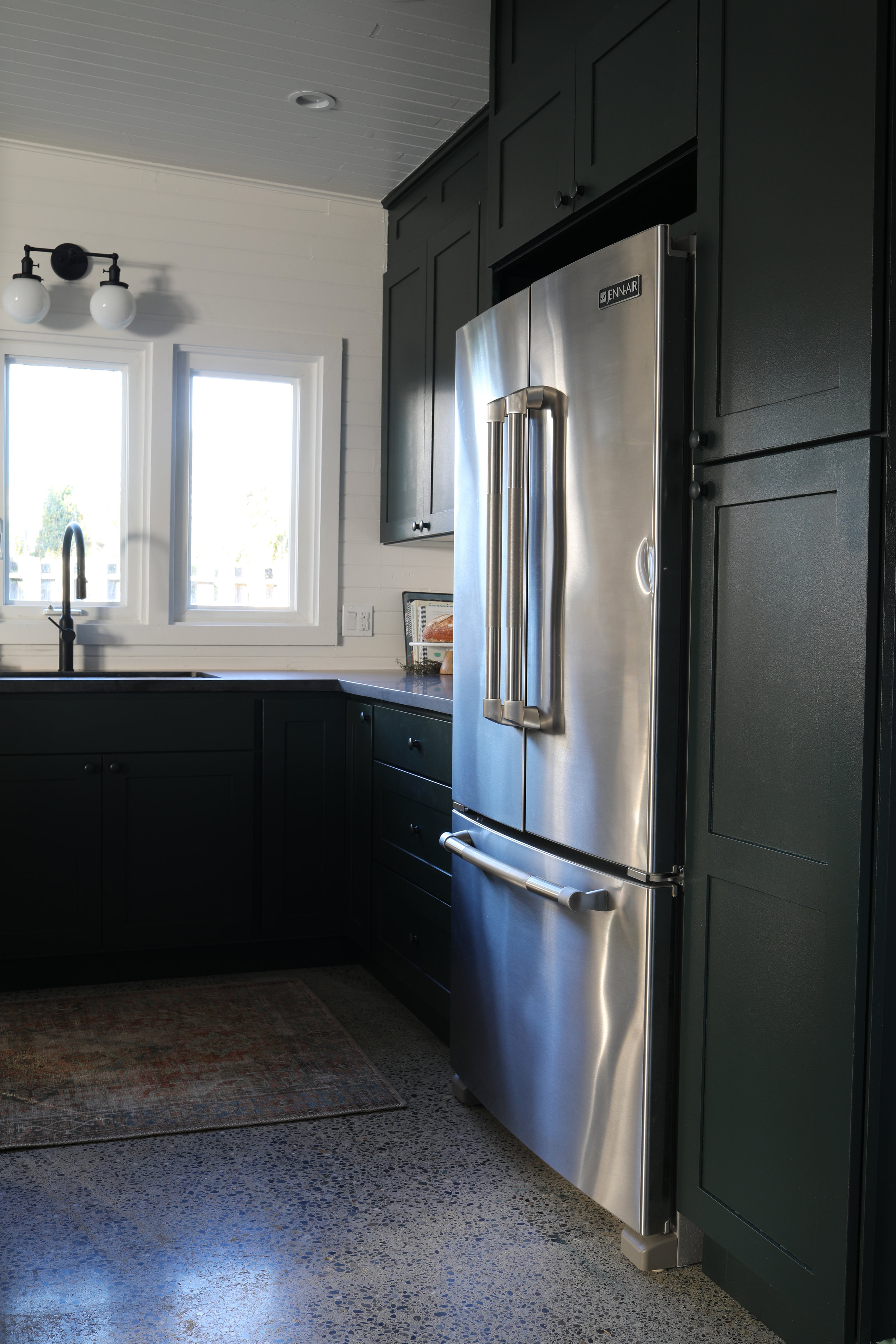
Yup, we went green! Sherwin William's Jasper is a rich and moody green that is so dark it almost reads black. We love it!
the ‘befores’
And of course, I'm dying to show you the rest of this kitchen reveal, but the 'after' photos won't be quite as beautiful if you don't know where we started from. So here's a look at this kitchen during demo.
This kitchen has come a looong way! We don't actually have a photo of the original kitchen, but trust me when I say, it was bad. The layout, the aesthetics, the functionality...none of it worked. So we were happy to help Naysa (Garrett's sister and the homeowner, pictured above) renovate it. There's an awesome story behind Naysa buying this triplex and it's all about student debt, house hacking, and improving one's financial situation through real estate. You know, the stuff Garrett and I can't shut up about ;) You can read Naysa's story here.
the ‘afters’
Okay, now for the finished space...
Garrett put together a video of the reveal, which you can see here:
DIY Renovating on a Short Timeline
Five weeks is just not a lot of time for a kitchen, especially when you're doing all the work yourself. But, it's done! Everything in this kitchen (besides the floors) was a DIY endeavor. Garrett even honed and fabricated the granite countertops. Thankfully we don't have 9-5 jobs anymore - you can read how we swung that here - so we were able to devote a lot of time to this project. Plus Garrett's dad is a retired electrician and Nana watched our kids a lot, so we had great help.
But make no mistake, getting this project done on the ORC timeline meant a lot of long days, short nights, and sacrifices elsewhere in our lives. Thankfully we're still happily married, our kids are no worse for ware, and we're really proud of the kitchen we built for Naysa.
Countertops
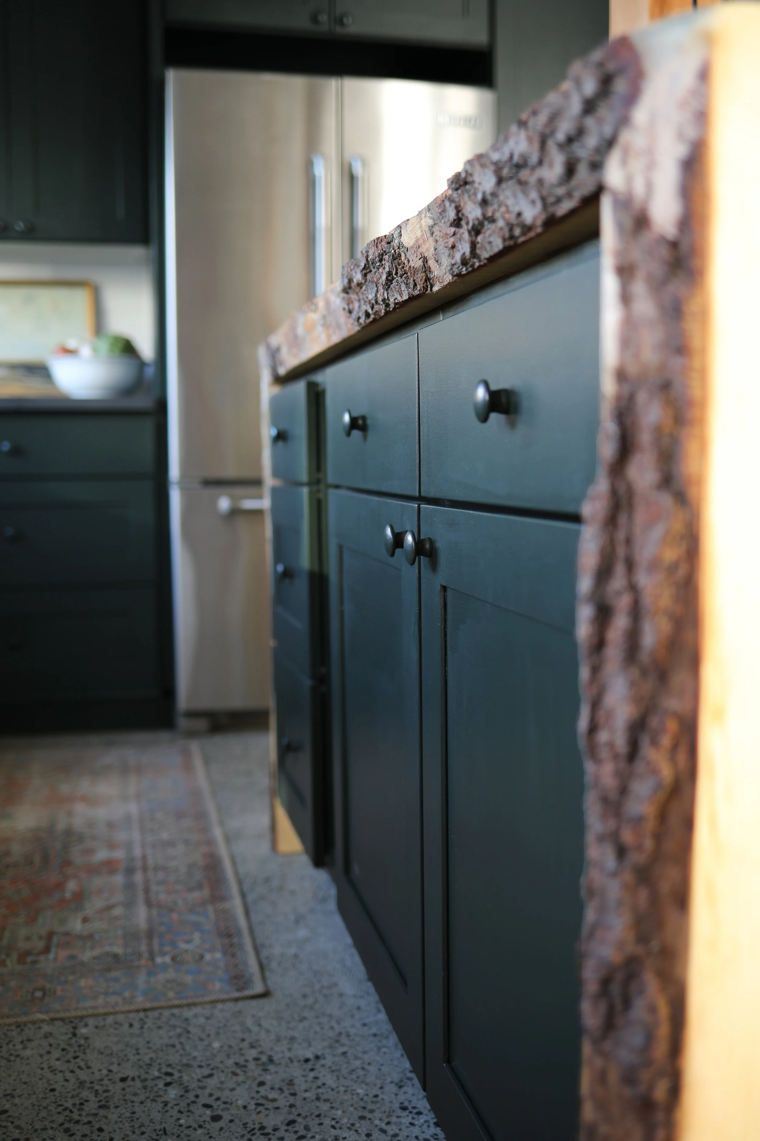
Let's talk about that big chunk of tree cascading over the island. Garrett found this 12' live-edge wood slab at an architectural salvage shop in Seattle and it brings in all the warm, woody Pacific Northwest vibes to this kitchen. It's definitely an unconventional countertop choice, but that might be exactly why I love it so much. We kept the wood natural with a simple butcherblock wax seal.
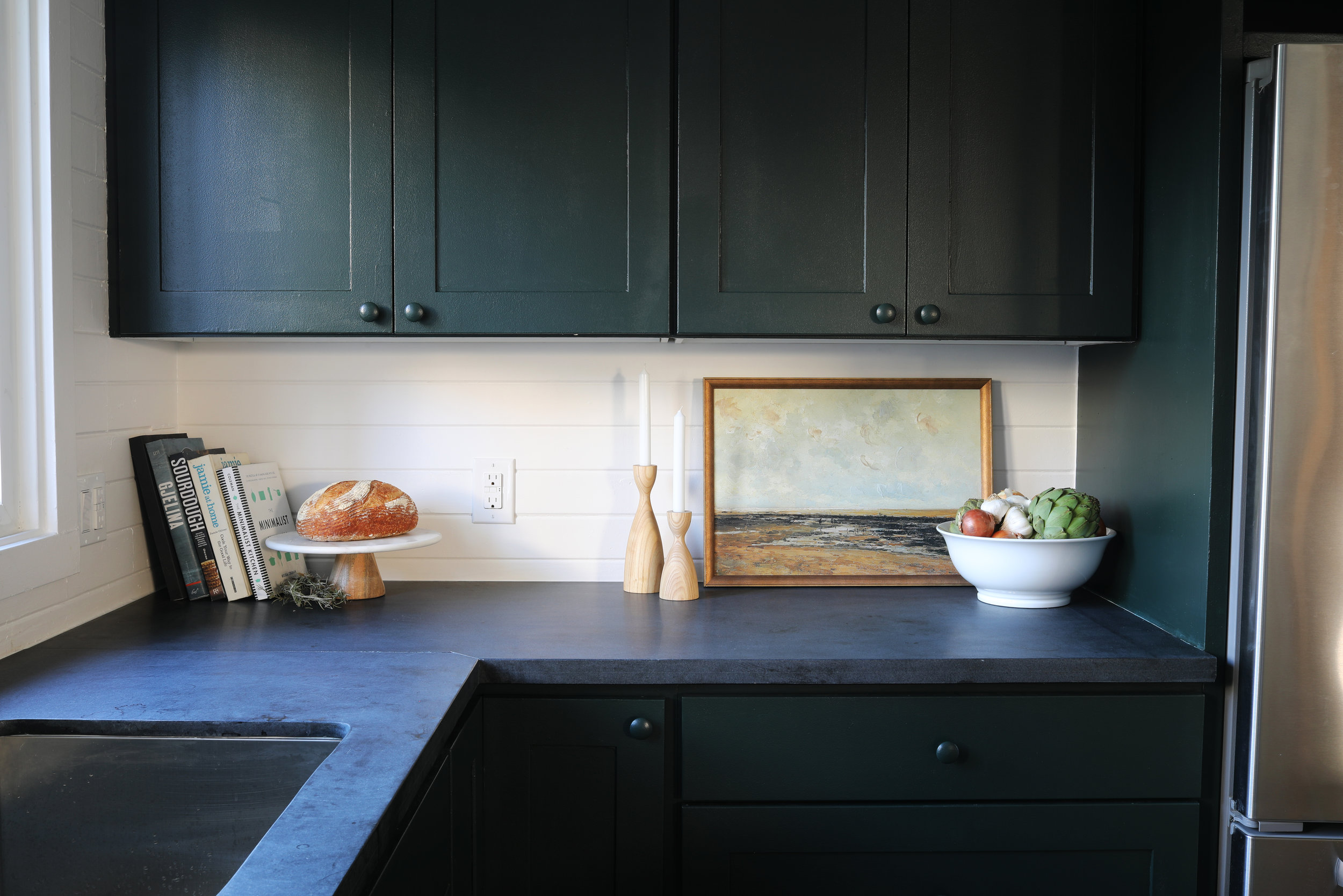
Not to be outdone, the honed black granite countertops are pretty lovely too. They came polished from GS Cabinets in Seattle in 8'-long slabs. Garrett honed the surface, cut them to length, and added the sink and faucet cutouts. I should mention that the granite countertops haven't been sealed yet. Which means they're soaking up everything we put on them - even the natural oil from those wood candlesticks. Ugh. We're planning to use a stone/tile/grout sealer next week and Garrett assures me it won't change the look.
Making Stock Cabinets Look More Custom
We almost always use basic stock cabinets, like we did in this kitchen, and we made them look more custom by adding a soffit, creating storage nooks in the awkward space between cabinets, and beefing up the toe kick with 4" base molding.
Floor-to-ceiling cabinets look much more custom than ones that stop 10" short of the ceiling. At least we think so, so Garrett built a soffit with a shaker panel front to match the cabinets. We also added a 4x1 piece of trim as a toe kick and ran it around all of the cabinets, even under the dishwasher (we screwed in that section so it can be removed if the the dishwasher needs serviced). The continual, beefy trim helps the cabinets feel more built-in.
The Perfect Moody Color
Finding the color for the cabinets took almost the entirety of the One Room Challenge. I originally planned on painting them black or charcoal and then considered all sorts of lighter greens (including the original retro green color), before circling back to a darker hue. Color. is. hard!
But I'm so glad we kept at it, because this deep shade of green (SW Jasper), which I originally saw on Mandy's front door, was worth the search.
Built-in Hood Vent
I've shared my love of built-in hood vents before, but I've got to say, the love has grown stronger. Garrett built this one in a weekend and shared the tutorial here. I especially like that this hood vent is boxy and modern, which feels appropriate for a 1950's converted garage.
When a Post Lands in the Center of Your Kitchen
Perhaps the biggest struggle we had with this kitchen was the post that lands in the center of the island. It's load bearing and couldn't be moved without replacing the entire beam above (ahem, not in the budget). Garrett did replace the original sandwiched-2x6 post with a fir 6x6 that he found at a salvage shop in Seattle. So the post itself looks a lot better, but even so, I struggled with how to make the post feel intentional (and dare I say, cool?) instead of awkward and arbitrary. I'm hoping you'll agree that the adjustable sconce light did just that. It gave the post a function and a reason for being there (besides, of course, holding up the roof ;).
And if you've read this far, I'll let you in a little secret. We forgot to add an outlet for the light on the island. It's required by code and we had talked about where it would go multiple times, but in the rush of finishing this kitchen, it just go missed. Ha! So that's the other item on the punch list.
Hardware
These days, metal hardware is the norm, but we opted for painted wood shaker knobs instead. There is certainly nothing profound about shaker knobs except perhaps how simple they are, and inexpensive (these were about $0.75/ea). But I really love these knobs. So much so, in fact, that I'm already planning to use them again in the next room we're updating at the Farmhouse (more on that soon).
The Art and Other Finishes
I've been dreaming about putting art in this kitchen since we started the renovation. Art a great way to add in some mood, interest, and old-worldliness. And the best thing about these pieces is that they got to come home with after we wrapped up construction!
I tried to keep the rest of the finishes moody and simple as well. There's a ceramic bowl full of hearty vegetables, a crock full of wood spoons, fresh flowers, a loaf of sourdough, cookbooks, soap and a brush for dishes, and a vintage-inspired rug.
Thank you
A big thank you to you guys for following along on this renovation and our other projects too. The Grit and Polish blog is sneaking up on 5 years and we wouldn't still be sharing these projects (and enjoying the heck out of it) if it weren't for your likes, comments, shares, and kind words. THANK YOU!
And in case you are wondering what Naysa thinks of her kitchen...well, she hasn't seen it yet. Ha! Fingers crossed she loves it as much as we do.
Sources
Sources are listed below (affiliate links included). Things not shown: cabinets from GS Cabinets in Seattle, the fir column and live-edge countertop are from Earthwise architectural salvage in Seattle, and the tongue-and-grove paneling is original. Appliances all came from Albert Lee's scratch-and-dent warehouse sale in Seattle (fridge - Jenn Air, dishwasher - Viking, range - Kitchen Aid), except the hood vent, which we provided a tutorial on here. We'll be sharing the cost of the renovation next week (if we can round up all the receipts by then) so stay tuned for that.
Sources: 1. SW Jasper / 2. SW Snowbound / 3. surfaces: polished concrete, honed black granite (from GS Cabinet in Seattle), live edge (found at Earthwise Architectural Salvage in Seattle) / 4. sconce over windows / 5. rug / 6. fruit bowl (similar) / 7. cake stand / 8. sconce on post / 9. landscape art (c/o)/ 10. horse art + vintage frame / 11.the Minimalist Kitchen cookbook / 12. candlesticks (c/o) / 13. crock with flowers (c/o) / 14. dish brush / 15. faucet / 16. knobs (similar)
That's it for another successful One Room Challenge! Check out all the ORC featured and guest participants room reveals here...there are SO many good ones!
Want more dark kitchens? Check out this beautiful moody kitchen from my friend, Sarah!
*Post updated 10/02/2019


