The Farmhouse | the Tour Continues Upstairs
THE FARMHOUSE I'm coming to you on a Wednesday this week, because why not? We've been easing into country life over here - it's quiet (except for Garrett's hammer and the kiddos) and lovely but there's this utter neglect for schedules and most the time I can't tell if it's a Monday or a Saturday.
Anyway, today we're going to head upstairs for the next stop on the farmhouse tour (you can read part 1 here). The upstairs is comprised of a master suite, a hall bath, two additional bedrooms, a linen closet, a landing, and a whole lotta charm!
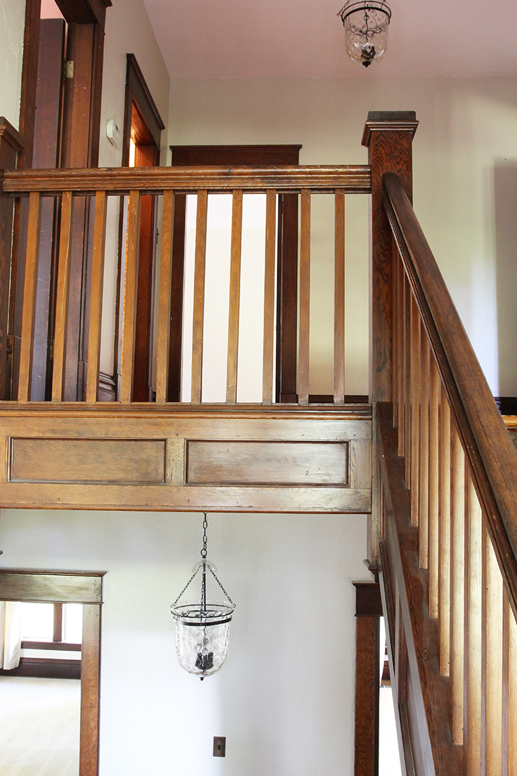
The landing at the top of the stairs is really spacious. No joke, it's larger than the Dexter House guest bedroom. And after so many years of small house, city living, this gal can't believe how luxurious a large, but utterly unnecessary, space feels! Well, it does serve one necessary purpose at the moment...storage for paint cans and tools while we work on restoring the bedrooms. I'll share more on that soon!
Off the landing, are five rooms. To the south are the nursery and linen closet, with the master suite to the west. To the east is the stairwell with its three large windows overlooking the yard, and finally to the north is Wilder's room and the hall bath.
I had originally intended for the nursery to be a spare bedroom and play space, but we have failed (utterly failed!) at getting the boys to share a room, so for now, this will be Brooks' room, at least until we are ready to try moving Brooks in with Wilder again, maybe when he's 8...or 18. Kinda kidding. But I'm serious when I say, please parents tell me how you get your kids to sleep when they are sharing a room!
Anyway, here's a look at what will be Brooks' nursery:
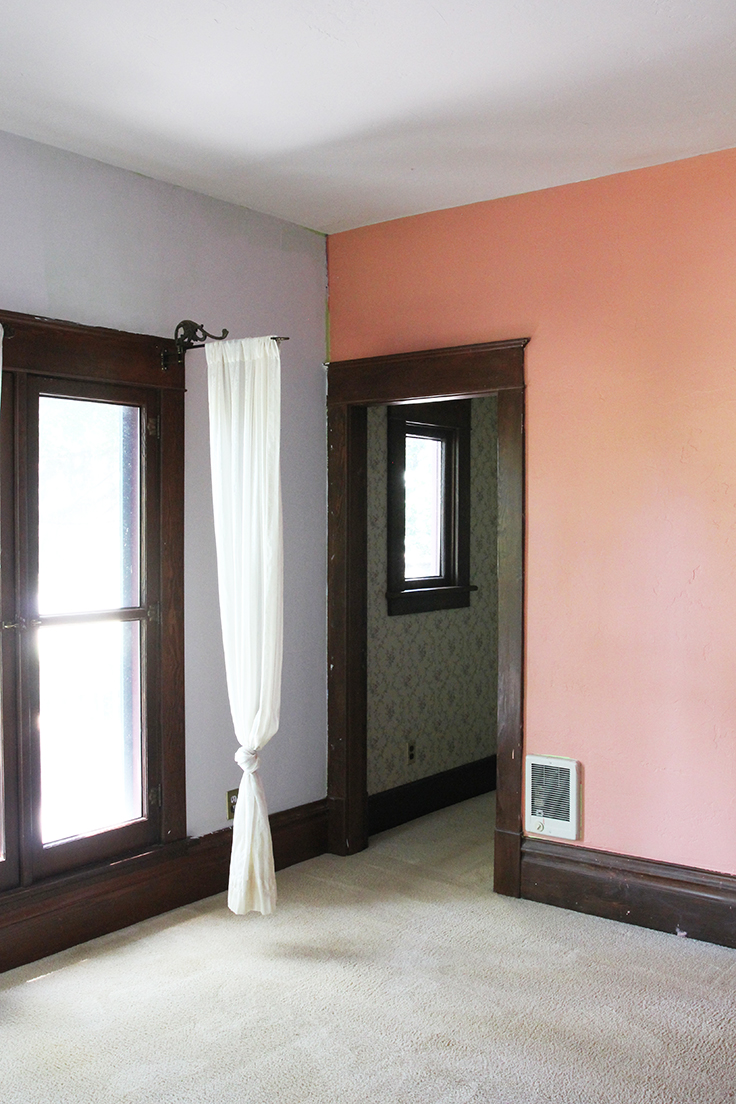
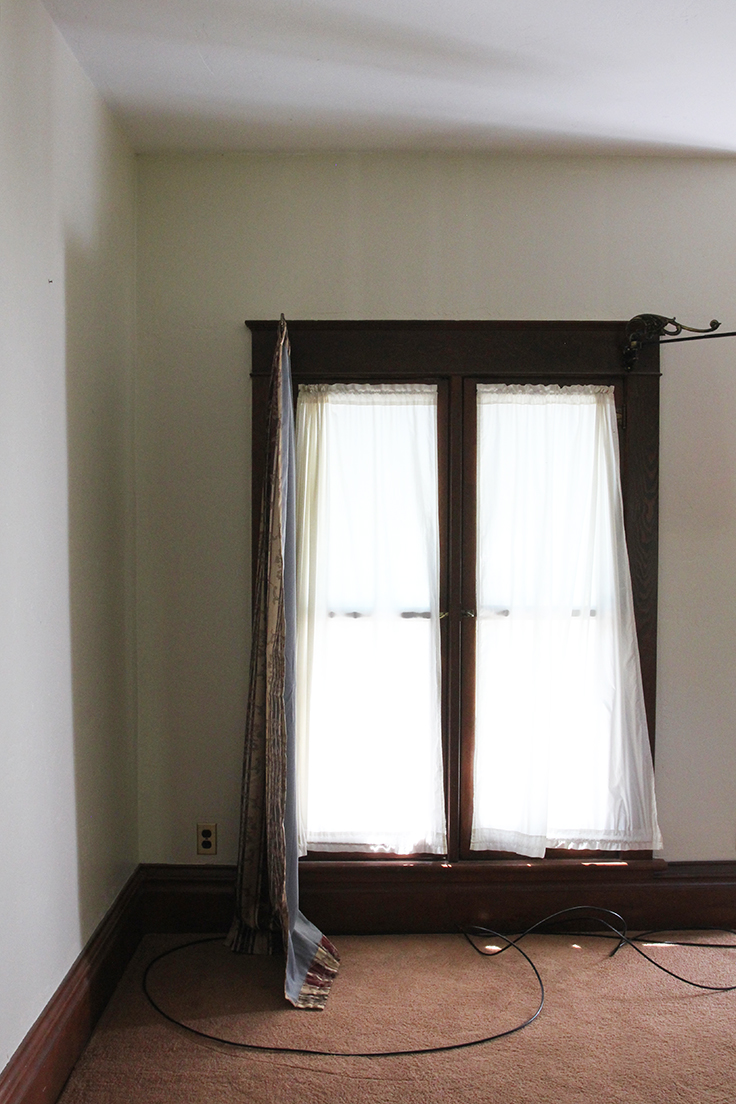
I love this room because of those stunning windows and all the southern light they bring in. It is pure magic in the afternoon! The narrow casement windows open onto the substantial front deck, which at the moment, has a completely inadequate rail (it's maybe 14" tall and looks to be rotting), so it's not a space for kids.
Unfortunately the previous owners had a, shall we say, eclectic color scheme in this room, so prepare yourself.
Yup, three colors. Purple, salmon pink, and lime green peaking out underneath the primer that the previous owners half-heartedly threw up before selling. Thankfully those colors are ALL gone now and the space feels a whole lot less like rainbow sherbet.
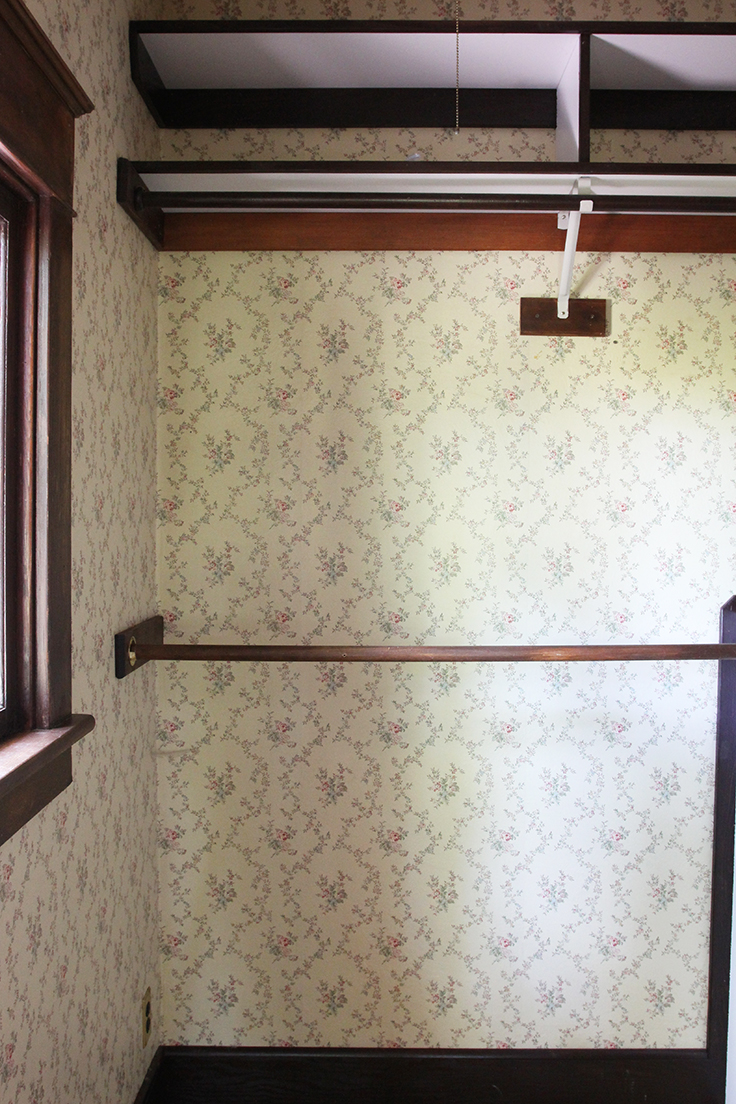
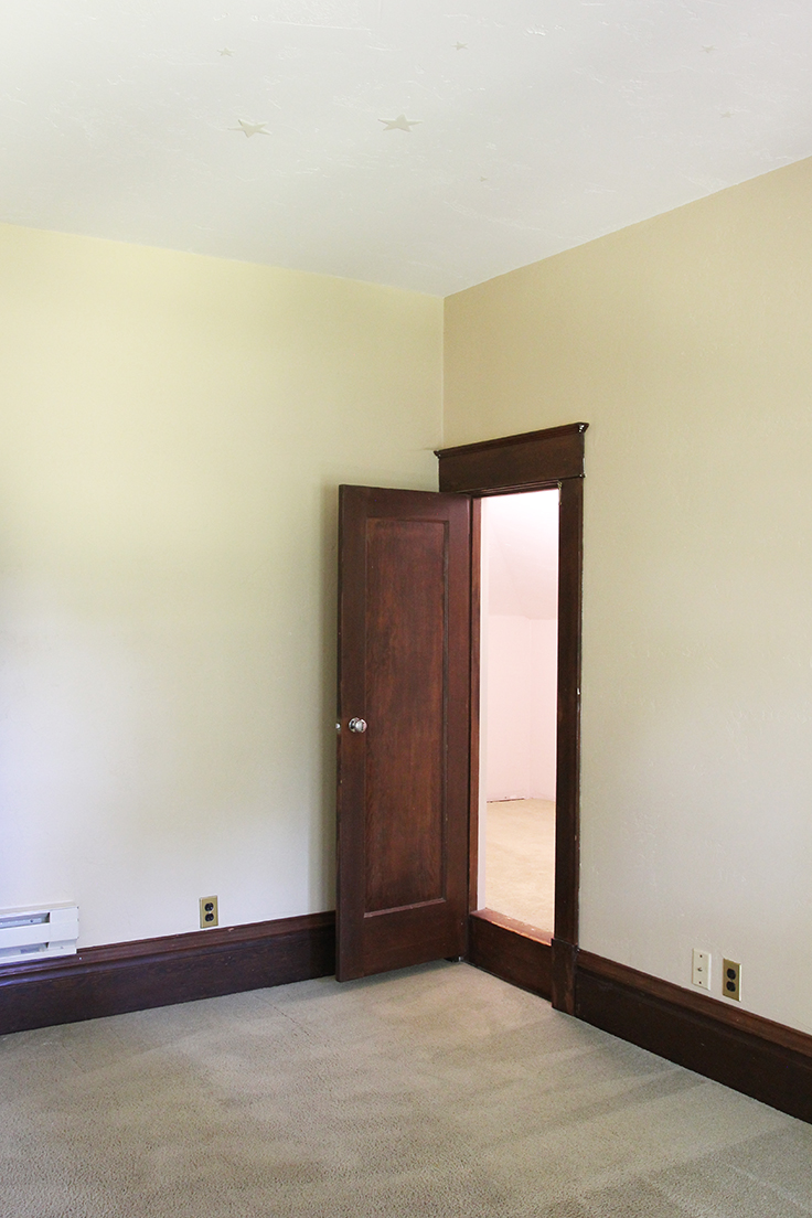
The closet in this room is large, at least by my standards, and I kinda dig the wallpaper despite the fact that the floral does *not exactly* scream boys nursery.
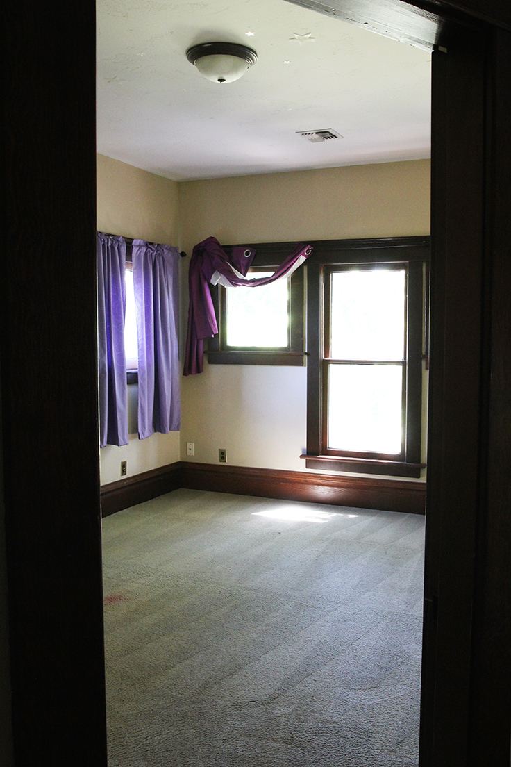
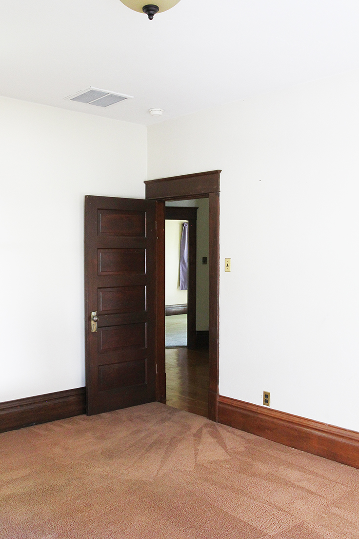
Now lets head over to the boys bedroom, which is just across the hall. I should probably call it Wilder's bedroom, but I'm trying to plant the you-will-be-sharing-a-bedroom-sometime-in-the-next-decade seed now. This is probably the least exciting room in the house architecturally speaking, but Wilder picked it because he loves the 30sf window-less closet play space.
Again, with the purple, right?! For most of us (read: everyone but Wilder), the best part of the room is definitely the windows, which overlook a huge, century-old Ash tree and a couple swings that Garrett has already put up. I'm not sure why the original architect didn't bring all three windows to the floor, but they do create a convenient space for putting two twin beds.
Here's a peak at the closet/play space.
Yeah, I know. The closet is dark and kinda creepy. But it's Wilder's favorite space in the whole house. Go figure!
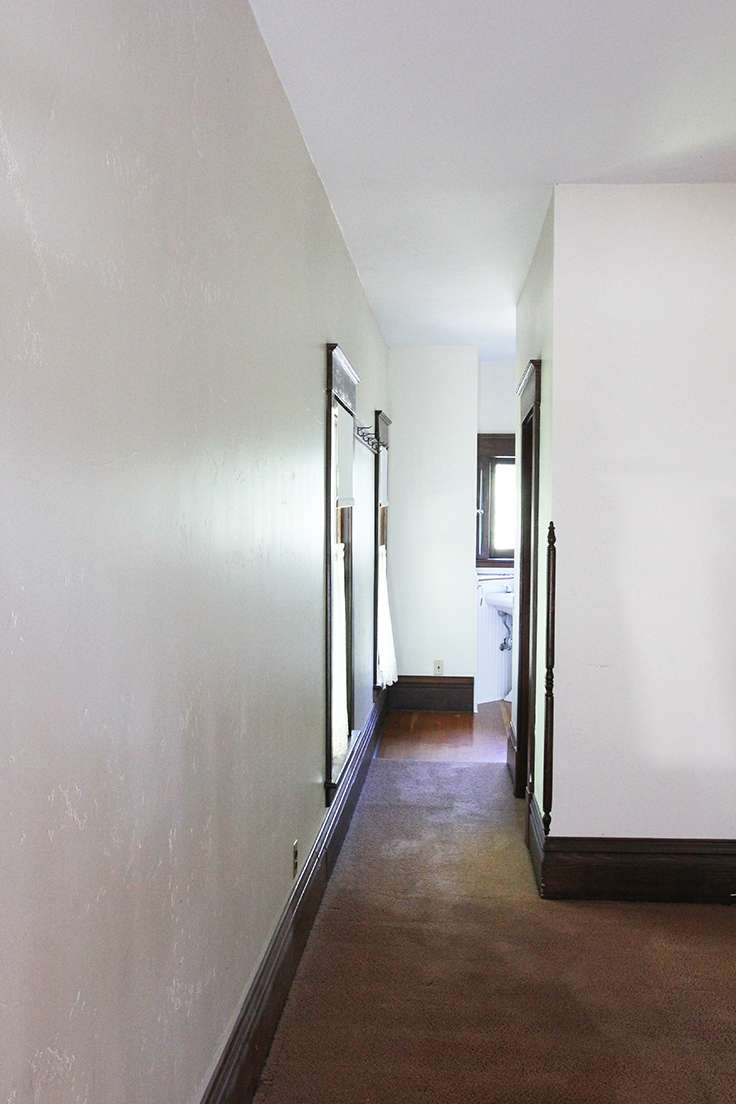
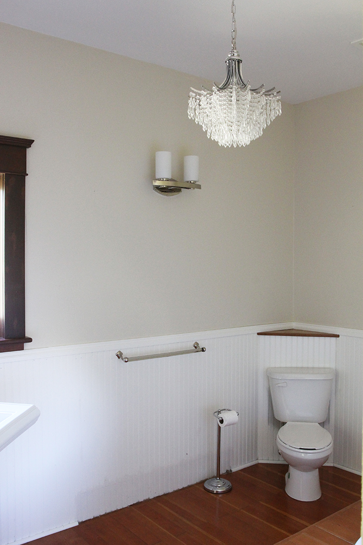
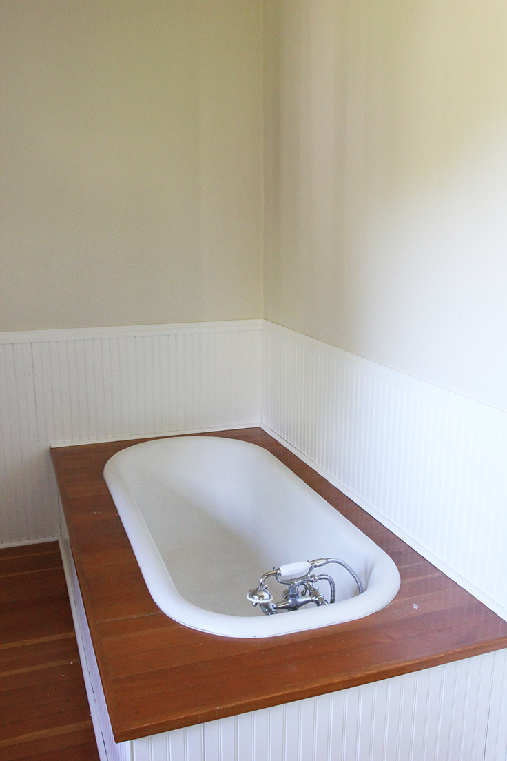
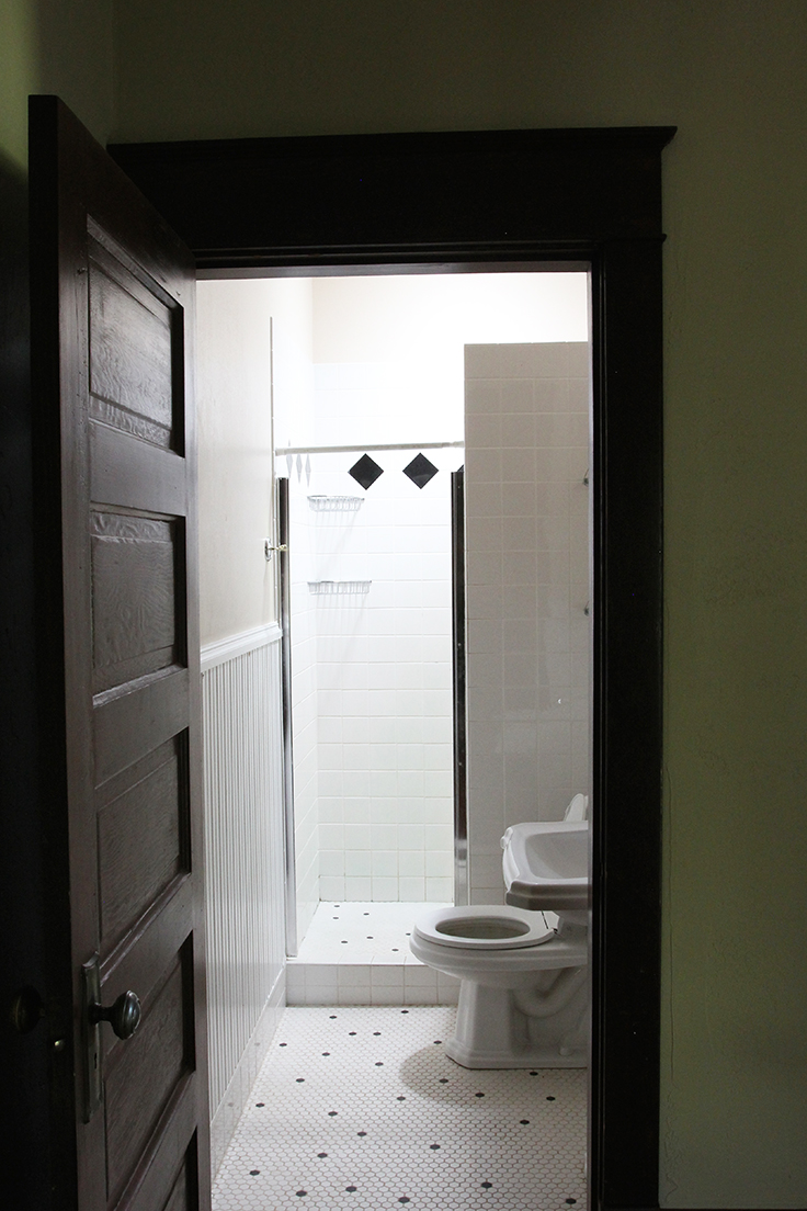
The next stop on the tour is the hall bath. This room has obviously been renovated. I'm pretty sure they took the bathtub out (I've never seen an old bathroom like this without one) and then shrunk the room to 4' wide. You guys might remember that I'm all about small bathrooms, but this bathroom is inefficient, which is the ultimate sin in my book. So this room is high up on the renovation to-do list.
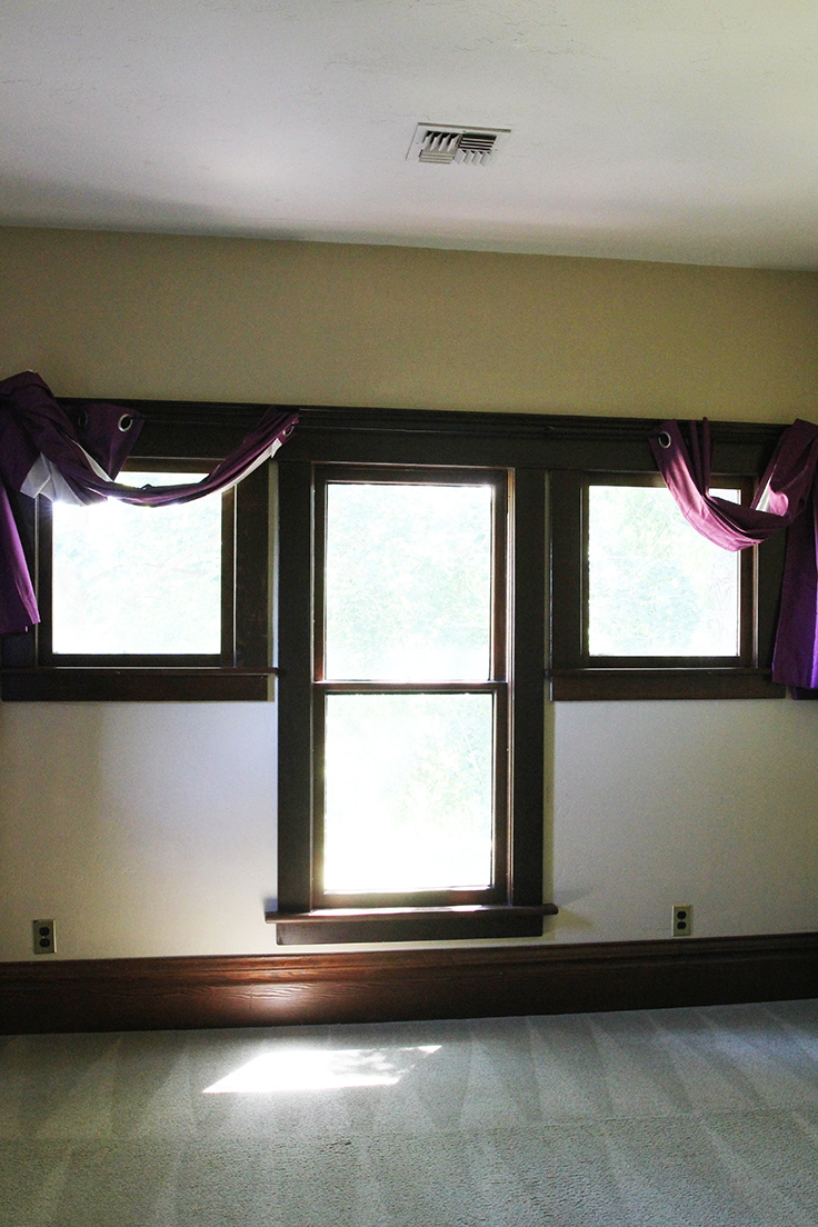
And now to the master suite. This space is full of charm and space (it's bigger than the whole cottage where Garrett, our dog, and I all lived together for 3 years).
The windows in this room mirror the nursery's, and although they are covered in some *interesting* drapes, they really are lovely. The casement windows also open onto the deck, which will be a fun space for us to hang out sans kiddos.
The master closet is huge by any standard and there's an interesting bathroom just behind it. Obviously this space has been renovated before, but a big part of me wishes that the upstairs rooms had been left in their original state, waiting for us to come along. Instead, we'll end up reworking other people's renovations, but that's how it goes with these old houses.
So that's the extent of the upstairs family spaces. If you missed it, here's the tour of the main living spaces, a look at the exterior, and the story of how we found and bought our home.
I can't wait to show you our first project here at the farmhouse! Until then, what do you guys think of these bedrooms. Are the paint colors, draperies, and carpets haunting you too?!
xoxo
-Cathy
p.s. Turning a schoolhouse into a house is high up on my bucket list. This one is amazing!
p.p.s. Did you hear the news?! Emily got an old tudor and I'm sooooo excited to see them fix it up!
p.p.p.s. Did you guys see that Rejuvenation used the Dexter House kitchen in their #myonepiece marketing?! Sure made me smile!

