Eek! We Started the Primary Bathroom Remodel
THE FARMHOUSE
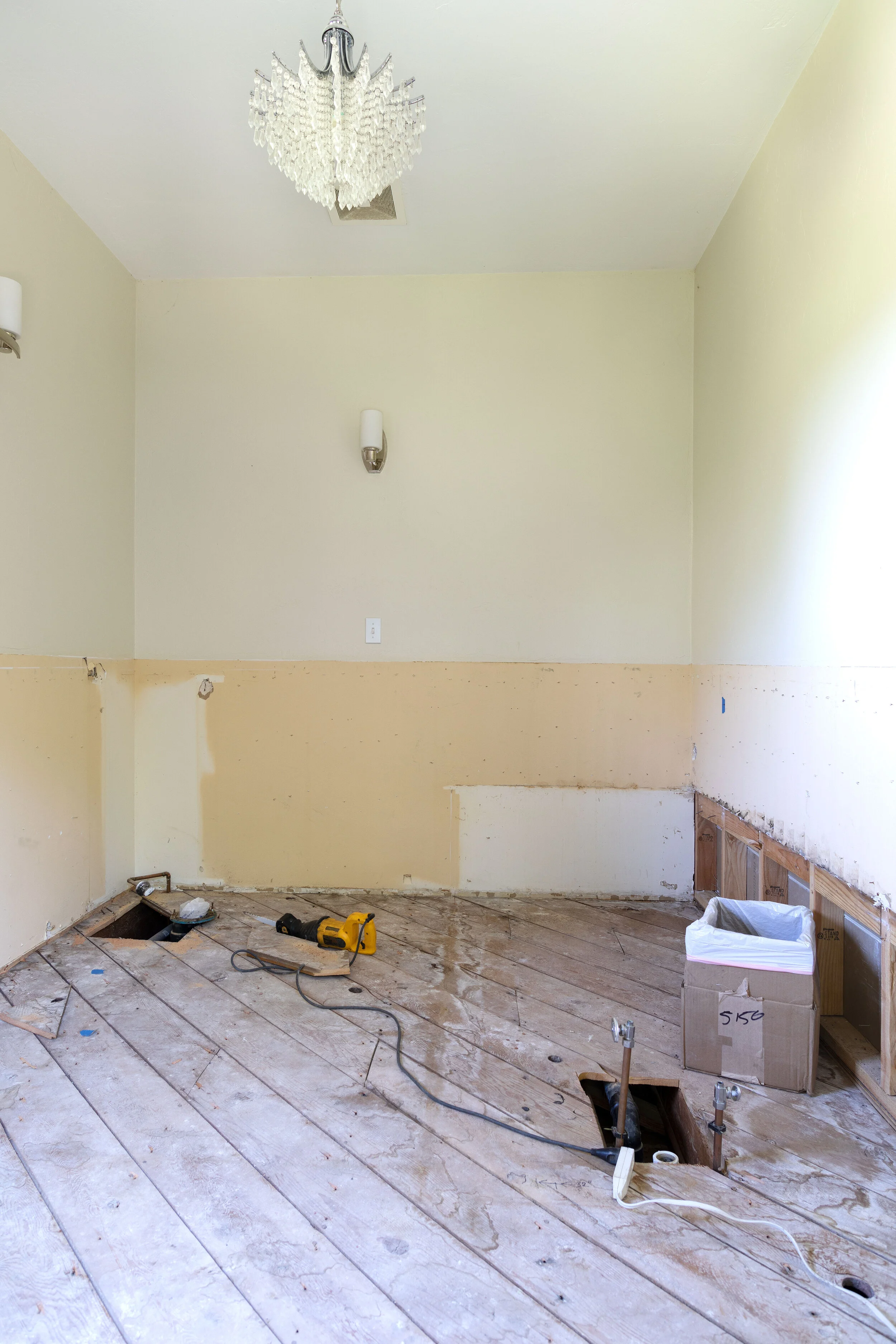
We had an impromptu start to our long-awaited bathroom remodel last week. Eek! With the Poplar Cottage still in for permit and 110-degree temperatures keeping us inside at our Farmhouse (thankfully with AC!) Garrett was itching to accomplish something. So he suggested we demo the bathroom. And I was like sure, why not start one more project?! So now our bathroom looks like this…
Can you tell we were having fun?! Some of you probably remember that we had planned to renovate this space last year, but tabled the project when the pandemic hit. With all the uncertainty in the world, we just weren’t ready to tear into this bathroom. We did, however, come up with 7 floor plans (with your help!) and picked our favorite. You can get caught up on all of that here.
Here’s what the bathroom looked like before last week…
That’s the original floor plan of the second floor of our Farmhouse (the primary bathroom is in the top right). Considering this house was built in 1912, we’re really lucky to have a large (100sf) bathroom attached to our bedroom! A previous owner converted a bedroom to create this primary bathroom and did all the hard work of getting plumbing to it. But we do have a couple of big issues with the space…
No shower! Now I love a good bath, but both Garrett and I tend to take showers at night and we had to go over to the kid’s bathroom to do that.
Zero storage. This bathroom didn’t have a single drawer or cupboard and that pedestal sink didn’t provide much countertop space.
Those were our big two as far as issues go, but there were more… The angled toilet. The tub surround that collected water whenever the kids bathed in here (which was often, since this is the only tub in the house). And did I mention the angled toilet?
Rather than jump into the full bathroom renovation we had planned on last year, we were hoping to keep the scale of this project a wee bit smaller. We thought we could address the main two issues we had with the space with a “light bathroom refresh”.
We thought we’d remove the surround around the tub and add a shower riser and curtain so we could take a bath or shower in the tub (little did we know the hardwoods didn’t extend under the surround). We also wanted to swap the pedestal sink for a long vanity. Oh and un-angle the toilet if it was easy to do. Nothing too major, but big improvements for this bathroom. But like so many remodels, it didn’t take long for the scope to increase…and the next thing we knew, we were back to a full-on bathroom remodel.
Our wheels started turning once we were through a bit of demo and could see how the plumbing comes in. We circled back to some of our favorite floor plans from last year and actually landed on something that looks more like option #2, but a little different…
Option #7 - space for everything
One of the big positives of this new plan is that it gives the adjacent kids bathroom 2’ of space from our primary bathroom (the boxed out space shown between the bathrooms). After using the 4’-wide kid’s bathroom exclusively for a week plus now, we realize that that space needs the room much more than our primary bathroom does! And that would also leave room in their bathroom for a tub in the future. BTW the new overall dimensions of the bathroom would be 10’7” x 8’2”.
Even after annexing those 2’, we’re still able to fit a new 3’x5’ shower in our bathroom along with a double vanity (it’ll likely need to be custom to deal with the awkward geometry around the tub/chimney, but that’s okay). We also love that this plan keeps the bathroom feeling light and bright and open, which is why there’s no closet for the toilet and only glass around the shower.
The tub also gets its place of honor in front of the window. You might remember that I’ve long dreamed of a clawfoot tub sitting in front of a large window with a country view and this is exactly that! And now that we removed the wall around the chimney (a game-time decision during demo), the tub should fit perfectly there. Speaking of the chimney, have a look at this beauty…
Not only did we get 10” of space by removing the wall that surrounded the chimney, but we also got a beautiful architectural detail! I think the brick will add some nice warmth and I just love the shape of it.
Here’s what the other side of the bathroom looks like post demo.
I still can’t quite believe we started this project, but I’m also crazy excited about it! Even if it does move really slowly, which it surely will since we have the Poplar Cottage to finish too. But honestly, considering how little use we were getting out of this bathroom pre-demo, we don’t feel like we’re missing too much with it demo’d. And I love having some time to make sure we get this bathroom right! Next up…picking finishes!


