8 Great Neutral Cabinet Colors for kitchens
Ever since I started dreaming about the Farmhouse kitchen renovation (as in the the day we moved in 😉), I’ve imagined a neutral cabinet color. Something light but off-white and with a hint of color to it. But finding that perfect neutral color is hard.
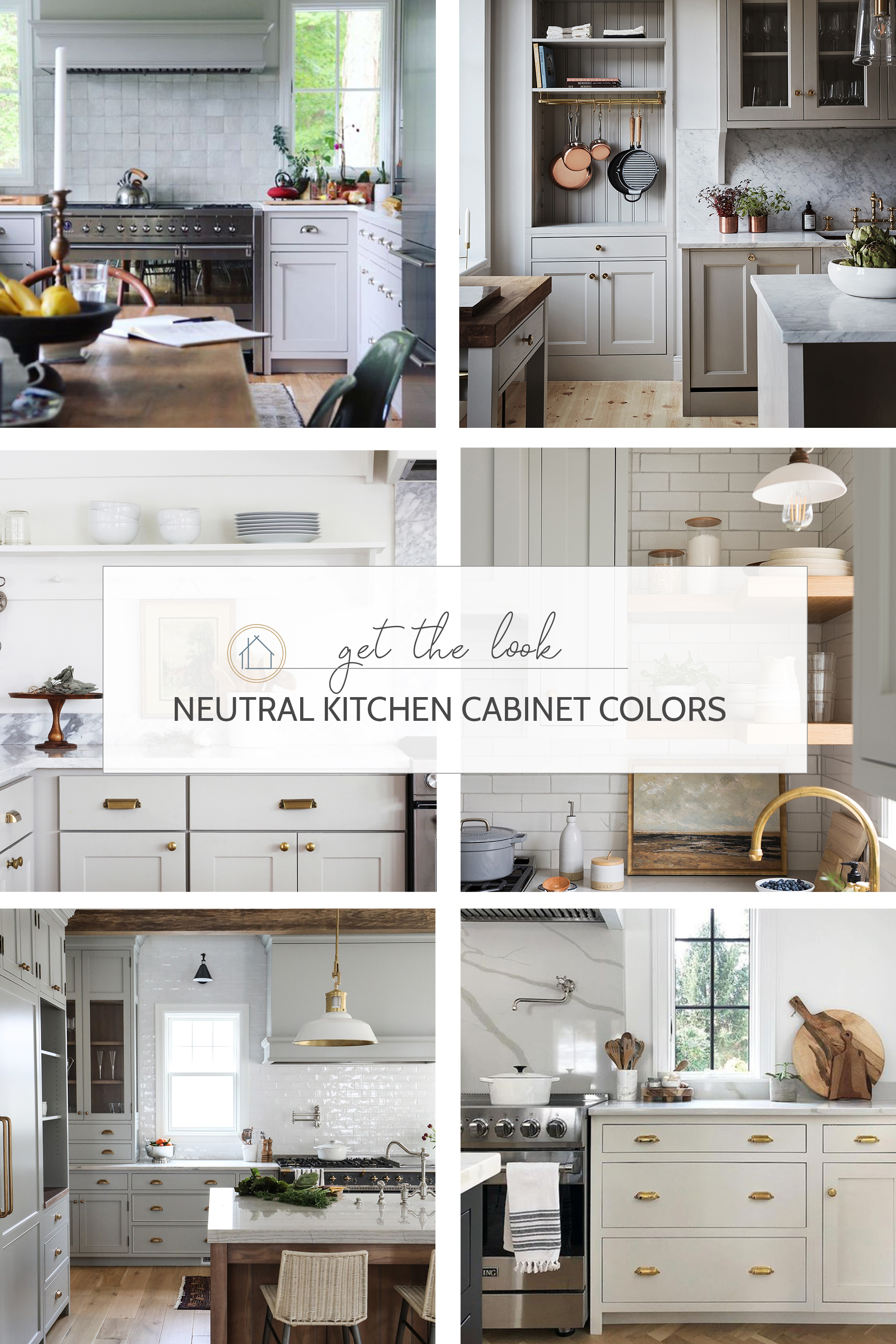
So I turned to some of my favorite designers and Instagrammers to see what they’ve used in their own neutral kitchens. And I’m sharing them today. All of these kitchen have done neutral perfectly well! Some are warm tones and some are cold, but they’re all beautiful.
Read on for 8 great neutral paint colors for kitchen cabinets (in real kitchens!).
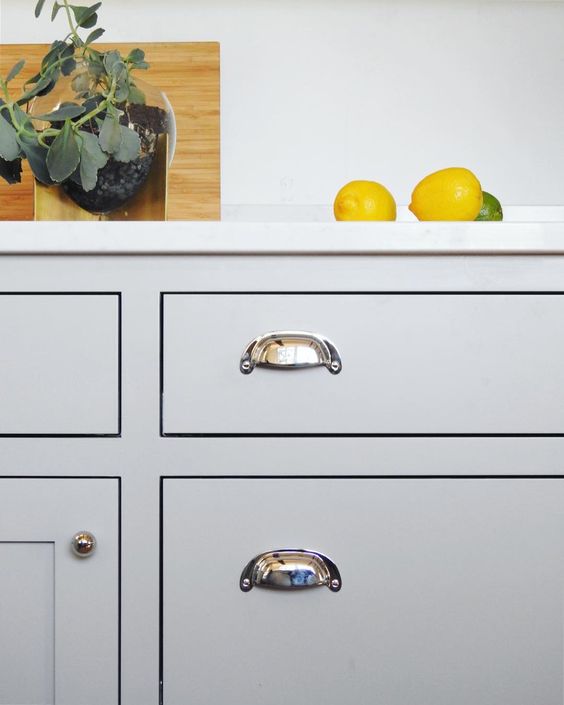
Farrow and Ball, Lamp Room Grey
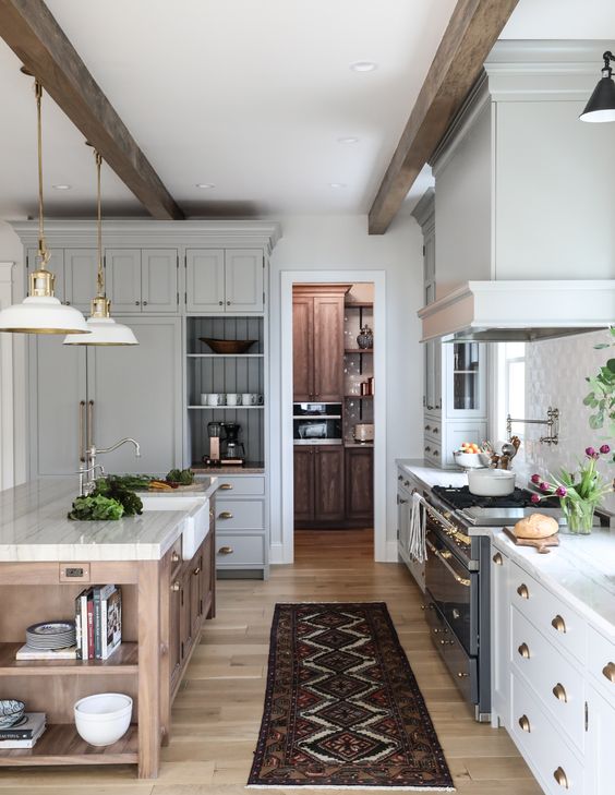
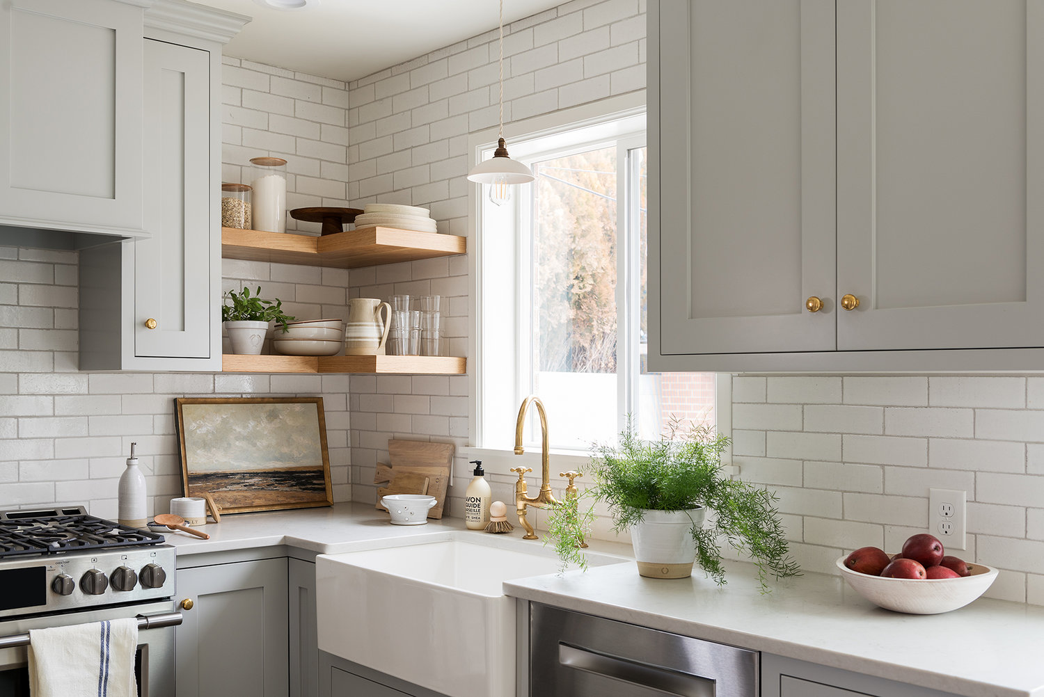
Lamp Room Grey is slightly blue grey and looks stunning in Park and Oak’s Hinsdale kitchen. It’s a soft grey that adds interest without strong color and a timeless feel. Farrow and Ball says about Lamp Room Grey “It is surprisingly strong when used in smaller rooms but softens in larger, well lit spaces.” Either way, it looks stunning in this kitchen!
FARROW AND BALL
lamp room grey No. 88
Farrow and Ball, Purbeck Stone
Natasha Habermann (@natashaHabermann)
Farrow and Ball describes Purbeck as a “a clean and understated mid gray”. It’s one of those calming neutrals that would feel great in both old and new homes. And of course it looks amazing in Natasha’s kitchen! I love how it lends this neutral kitchen such a moody and classic feel.
FARROW AND BALL
purbeck stone No. 275
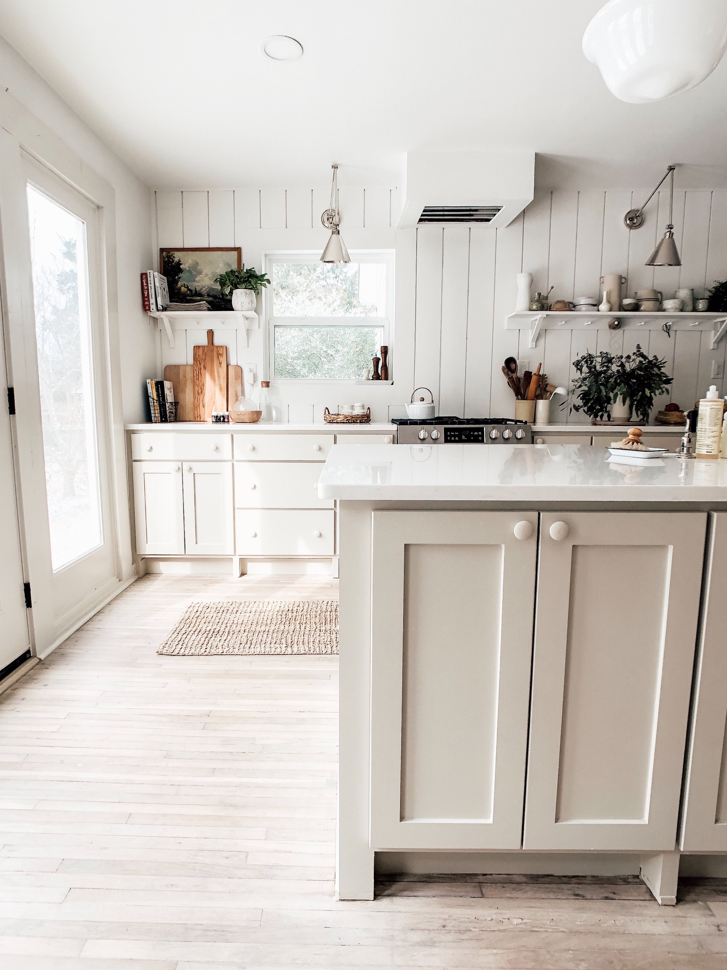
Dunn Edwards, Heather
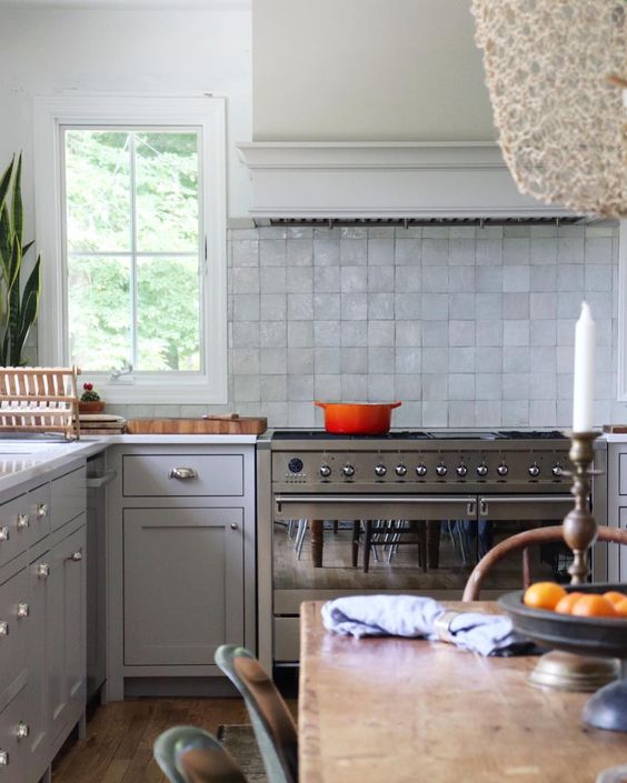
Heather is in Dunn Edwards’ “cool neutrals” section, but it definitely feels warm and modern in Emily’s kitchen. It’s light enough to be a warm white but rich enough to feel like a neutral. It feels very on-trend and would look so lovely in a country or farmhouse inspired kitchen.
DUNN EDWARDS
heather
Benjamin Moore, Classic Gray
Heidi Musser (@SimpleOfferings)
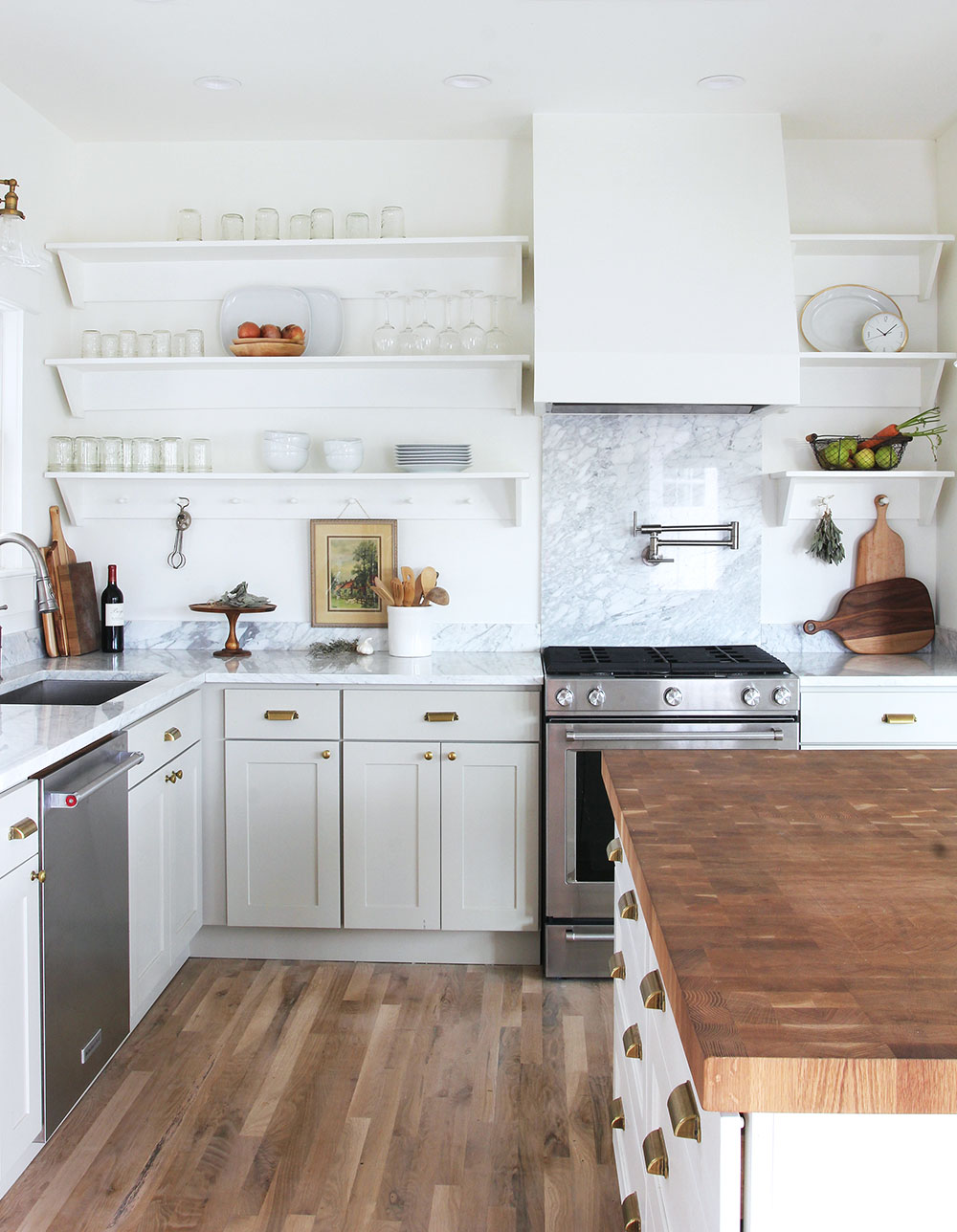
Classic Gray is part of Benjamin Moore’s “classic color collection”, which they describe as timeless and elegant. I can certainly see that in Heidi’s lovely kitchen. I love how well it plays with the marble countertops, wood floors, brass hardware, and black cabinetry.
BENJAMIN MOORE
classic gray
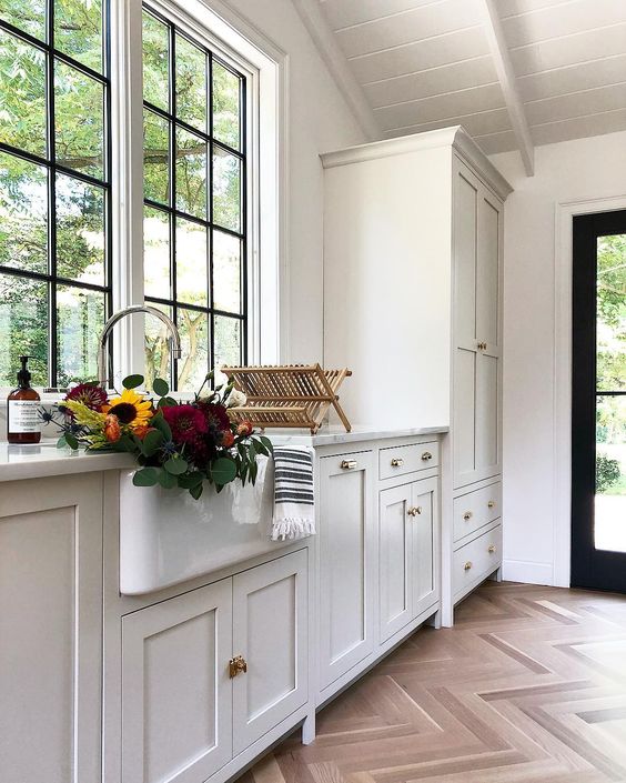
Little Greene Paint, Cool Arbour (UK)
Not going to lie, this kitchen by Kitchen & Beyond makes me want to fly to the UK to buy gallons of this lovely color (I haven’t found it in the US 😩). The color is warm and gray and slightly green. Moody but not dark. And it looks beautiful with marble. Perfection!
LITTLE GREENE PAINT
cool arbour No. 232
Farrow and Ball, Elephant’s Breath
Farrow and Ball calls this color a “warm and contemporary grey”. And I just love it in Bri’s kitchen. It feels so on trend and yet completely classic. It ties everything in Bri’s kitchen together so perfectly
FARROW AND BALL
elephant’s breath No. 229
C2 Paint, Vex
Our own Porch House renovation
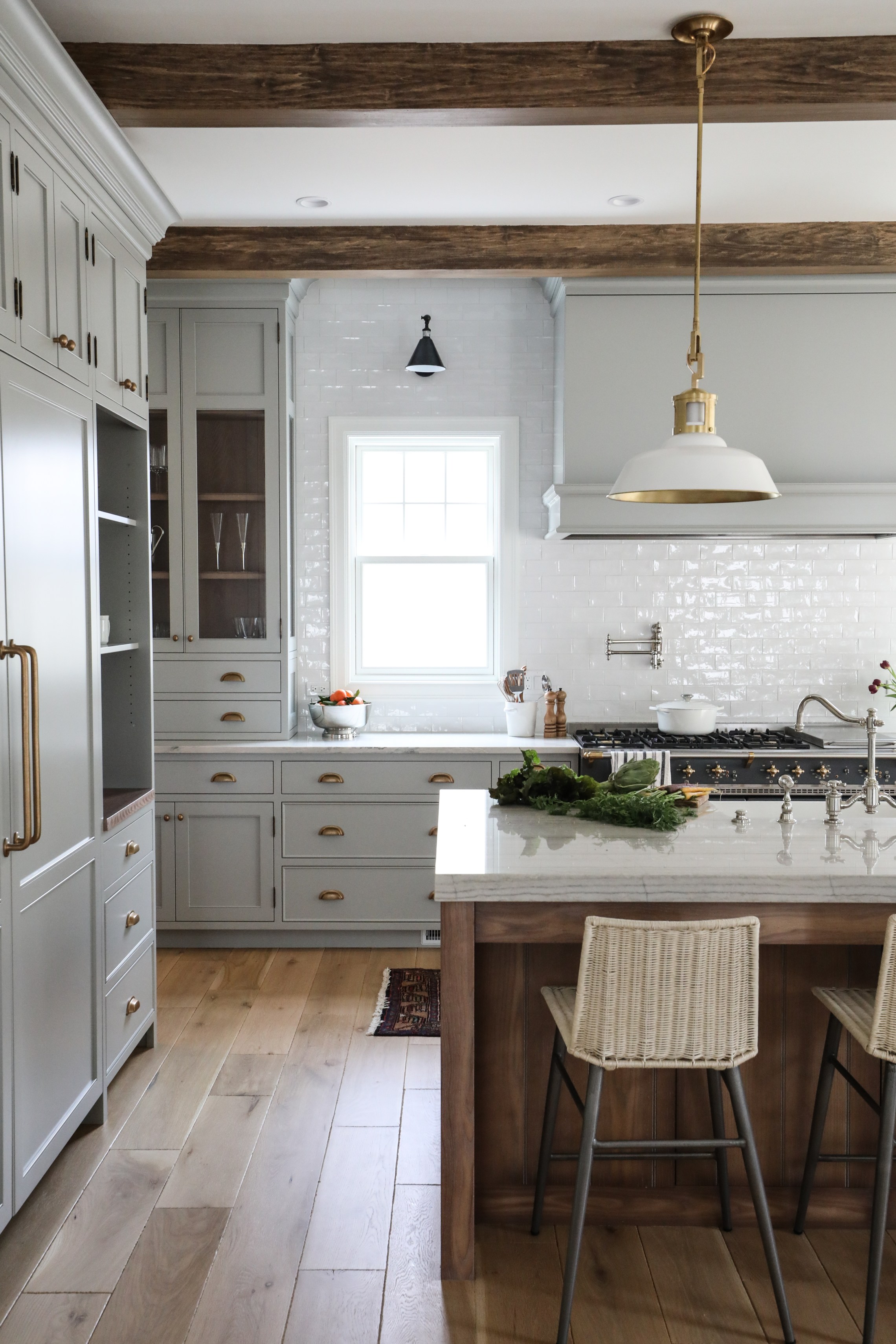
We used this natural color in the Porch House kitchen and I get asked about it all the time! It’s definitely a neutral, but reads green in different lights. It is close to BM’s Revere Pewter on the sample card, but in person it reads like a very soft sage green or neutral.
C2 PAINTS
vex
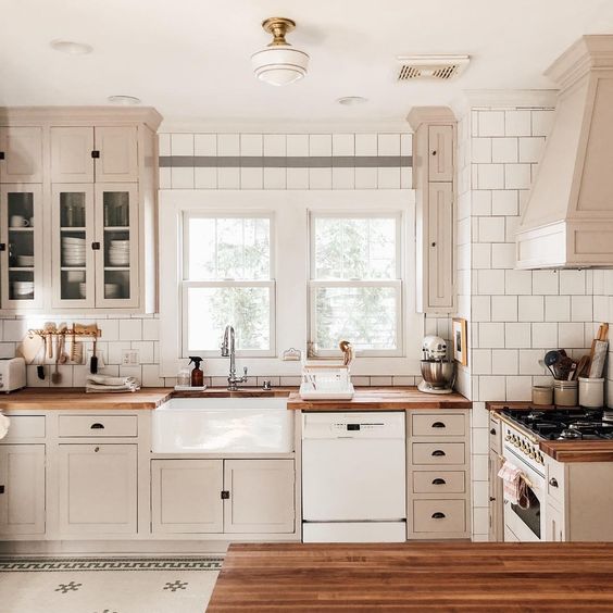
Benjamin Moore, Coventry Gray
@tingefloral’s kitchen (photos via Studio McGee)
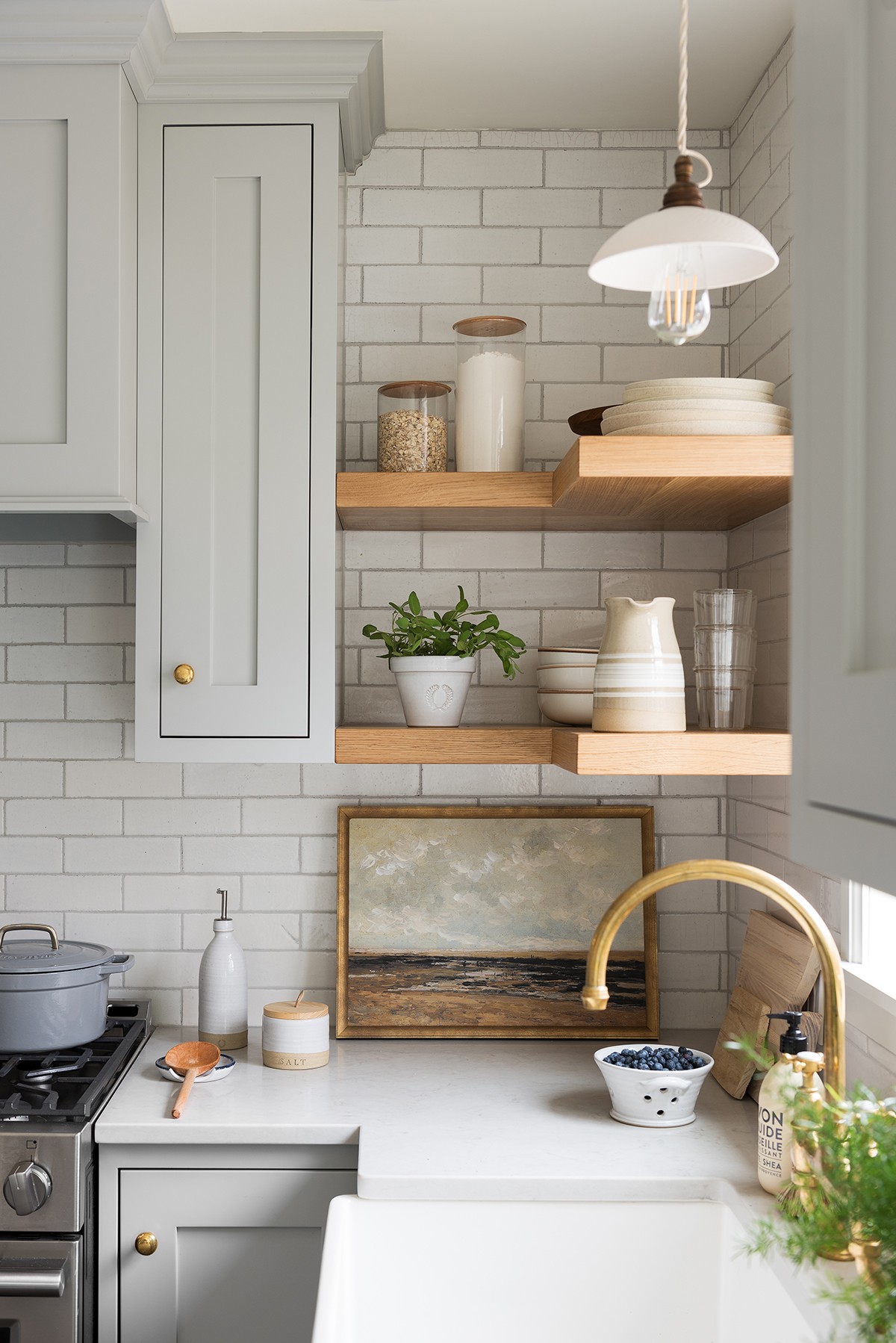
Coventry Gray is in Benjamin Moore’s historical colors collection and while I certainly see it’s timeless appeal, I love that it gives off a contemporary vibe in this kitchen. And it looks absolutely stunning paired with warm brass and wood.
BENJAMIN MOORE
coventry gray
What about you? Any neutrals you love in the kitchen? Or do you have any favorite warm/green/greys that you recommend we check out?

