On the Hunt for Tiles that are Timeless AND Fun
We have 3 bathrooms to remodel this year. THREE! One at the Farmhouse and two at our in-town Poplar Cottage project. So I’ve been staring at tiles for hours and hours lately, and I thought I’d share what I’m looking for and what I’m loving right now. This is basically a guide on how I’m sourcing timeless tiles that look good in an old house and feel a bit fun/fresh/exciting too! Let’s get into it…
Katie Leclercq, photo Aaron Leitz
One thing about Garrett and my projects (8 old houses and counting…) is that we want to make sure we won’t need to re-remodel our remodels anytime soon. We renovate for the longterm and look for materials, shapes, and colors that won’t feel dated in 10 years. Words like classic, timeless, and well-made are always on our minds. But after a bazillion plain white subway tile installations, we are also looking to have a bit more fun with the tiles in these three bathrooms. Here’s how I’m attempting to do that design-wise…
general tile inspiration
Three specific things I’m looking for in the tiles I’m sourcing right now…
Look to the house itself
The first source of inspiration for me is always the house itself. What style is it? When was it built? What kind/shape/colors of tiles were originally in the house. What’s the formality level, vibe, feeling, personality of the structure. These are all questions I ask myself when designing a bathroom in an old house. For our 1912 Farmhouse, that means sticking to marble or porcelain and a hexagon shape on the floor and some sort of rectangle or square on the walls, to keep with the vintage and personality of the house.
Of course sometimes a house doesn’t have a lot of personality to begin with, which gives you more of a blank slate. The Poplar Cottage definitely fits that bill. The house’s style is nondescript and it was likely designed and built by a layperson - let’s call it folk architecture - so I feel a lot more freedom picking out tiles for that house.
Quality
Quality never goes out of style. Well-made tiles will last longer and look higher end. This is one area we never compromise.
Cohesion
Have you ever been in a home where one room just doesn’t fit. Like a 1970’s game room in a colonial; or 1950’s wood paneling in the den of a tudor. You know the space…the one that just doesn’t feel like it belongs nestled amongst the cohesive rooms of a home. That’s exactly what we don’t want, so we aim to keep the feel consistent throughout the house, bathrooms and all.
How to make it fun…
For me, fun can mean fresh, detailed, or otherwise interesting. And here’s how I’m planning to accomplish that…
One part classic, one part fun
Opt for vintage-inspired tiles in an unexpected color way. Or a classic tile in a new and different pattern. Put traditionally-bathroom tiles in the kitchen. Or mudroom. Go with a classic shape in an unexpected size. You get the idea… keeping one element of the tile work securely rooted in tradition and one element fresh and new, lends to a fun yet timeless take on your tile work.
Details, details, details!
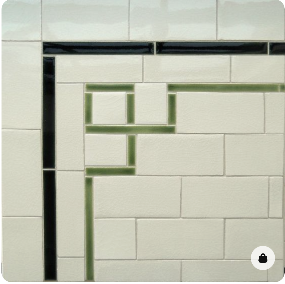
Adding details into the tile work - a pencil tile running through the subway field, a border on the floor - can add a lot of interest to tile work and lend it a fresh feel.
Play with matte and gloss
There’s fun to be had in turning a classically matte tile, glossy. And visa versa. It’ll make a simple tile unexpected.
Examples…
Words can’t capture these ideas like images. So I’m sharing a bunch of inspiration images that have caught my eye and steered me in certain directions as I look for tiles for our 3 bathroom remodels. Have a look…
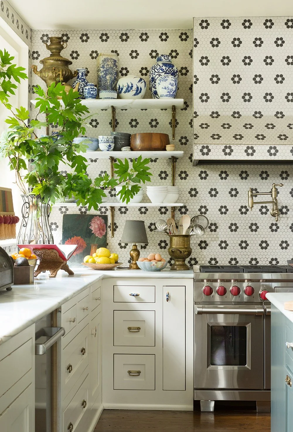
First up, a traditional hexagon flower pattern in three unique ways that feel fresh and fun… The first is classic color way in an unexpected location.
design Pierce and Ward, via All Sorts Of
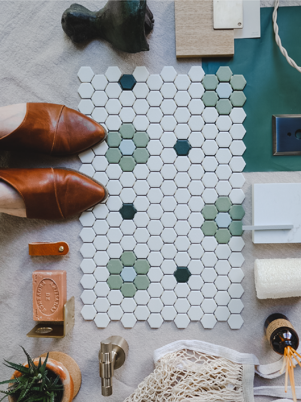
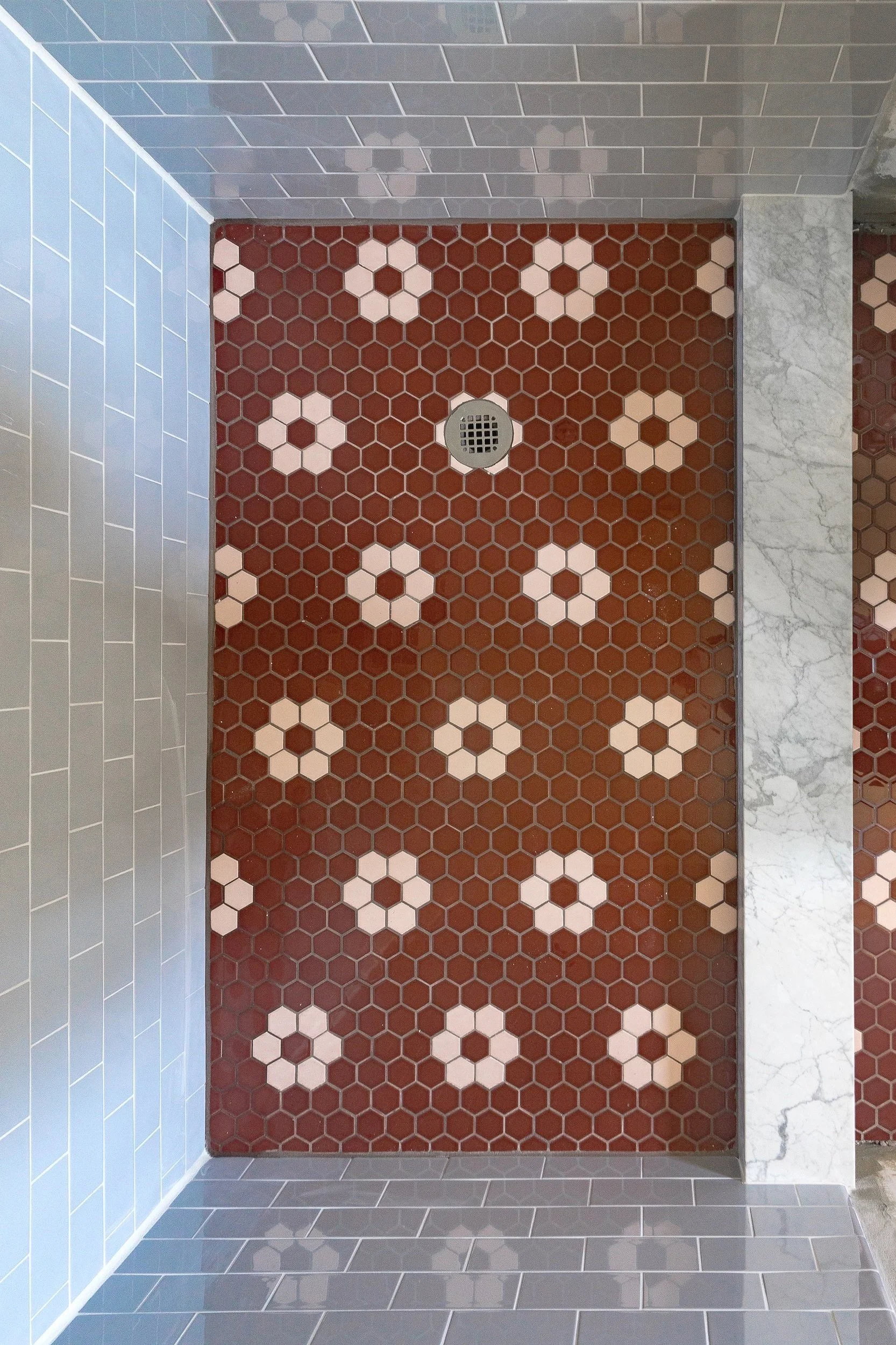
And now for hexagon flowers in a classic location (bathroom floors) in unexpected color ways…
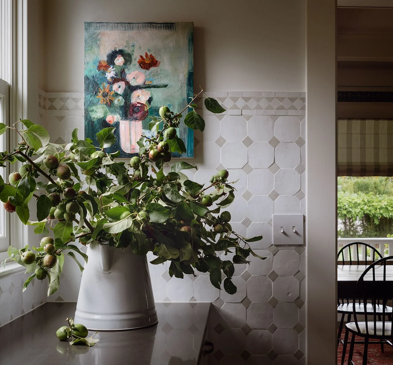
Here’s another pattern I love - it’s an octagon with a square and I’m not sure formal name, but it’s a classic. Zio and Sons x Cle Tile (the line I’m 99% sure these tiles are from) took it to a new level with handmade Zellige tiles that feels classic and fresh.
Katie Leclercq, photo Aaron Leitz
If you’re going with classic white subways, here’s a fun detail to freshen the look up. I might have to copy something like this for our kids bathroom at the Farmhouse.
Pinterest (original source unknown)
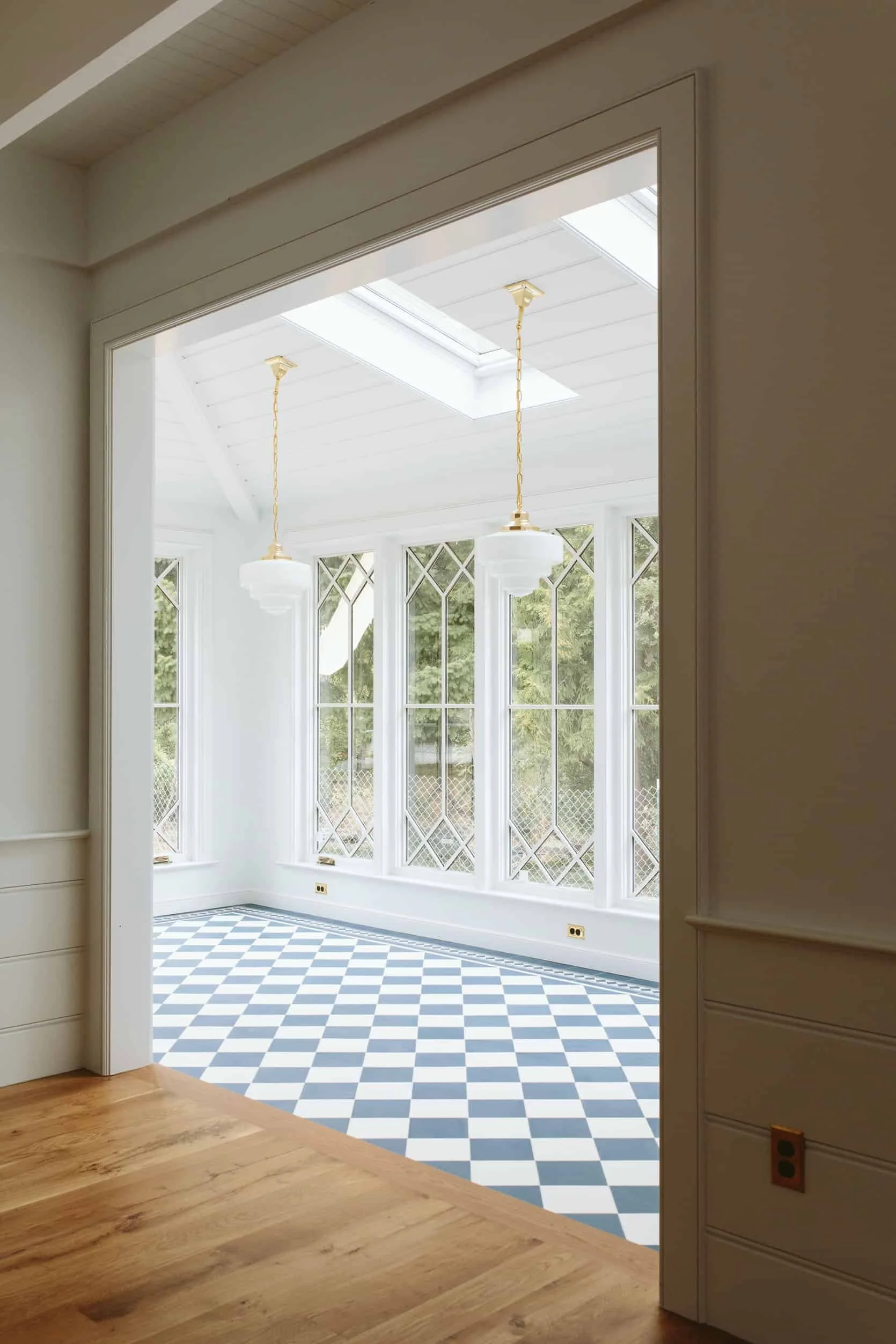
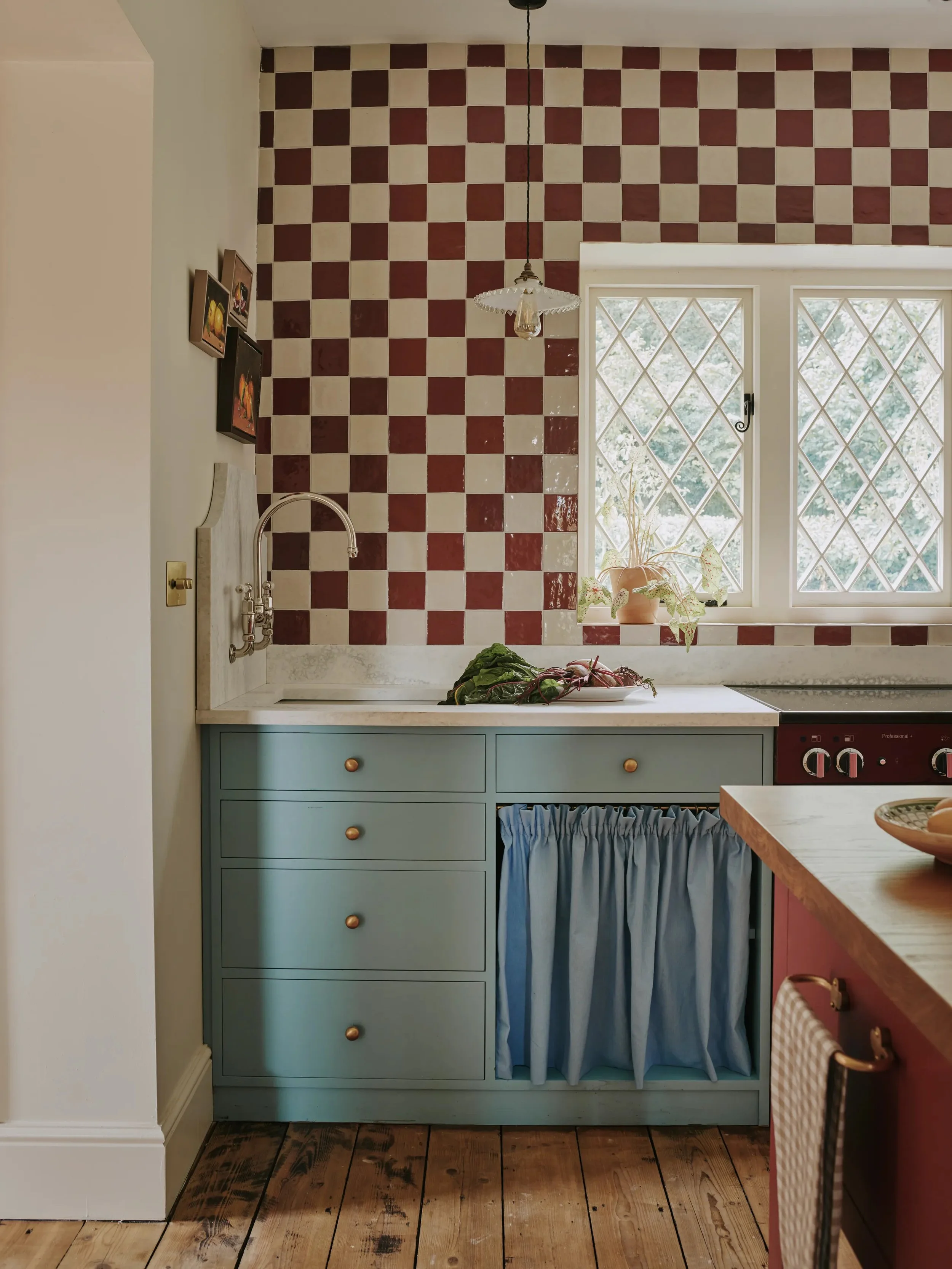
Checkerboard is really popular right now, but it’s also a classic pattern that should stand the test of time. I love how these ladies below brought in unique colors and textures and borders to make the pattern feel fresh.
Another classic pattern, this time checkerboard, in an unexpected color way and location.
designed by Emma Ainscough, via
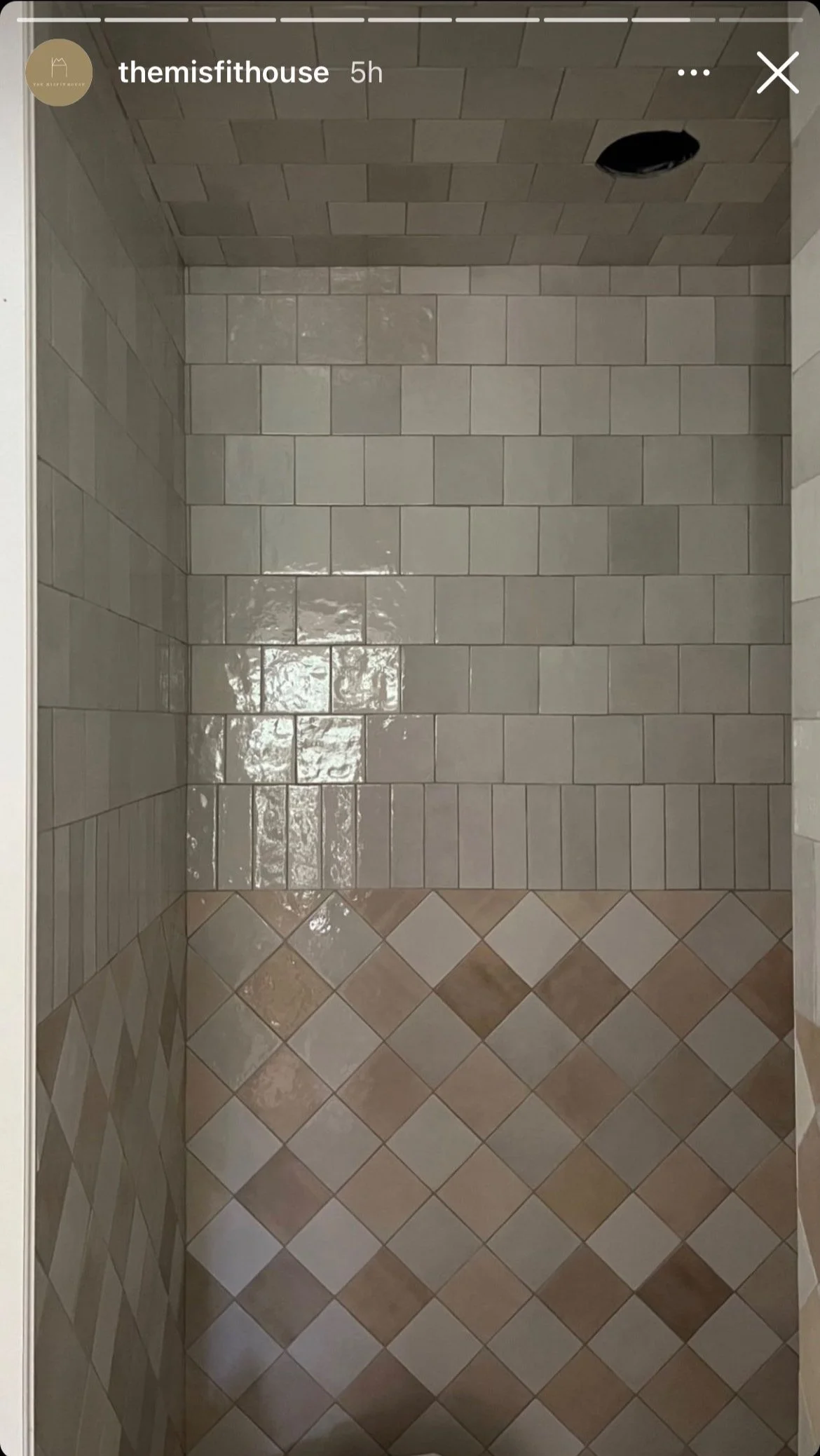
Here’s a favorite from Misfit House (Monica is such an amazing designer!). I screen-shotted this months ago and keep coming back to it. The stone and simple colors keeps it feeling classic but there’s something really fresh about it too.
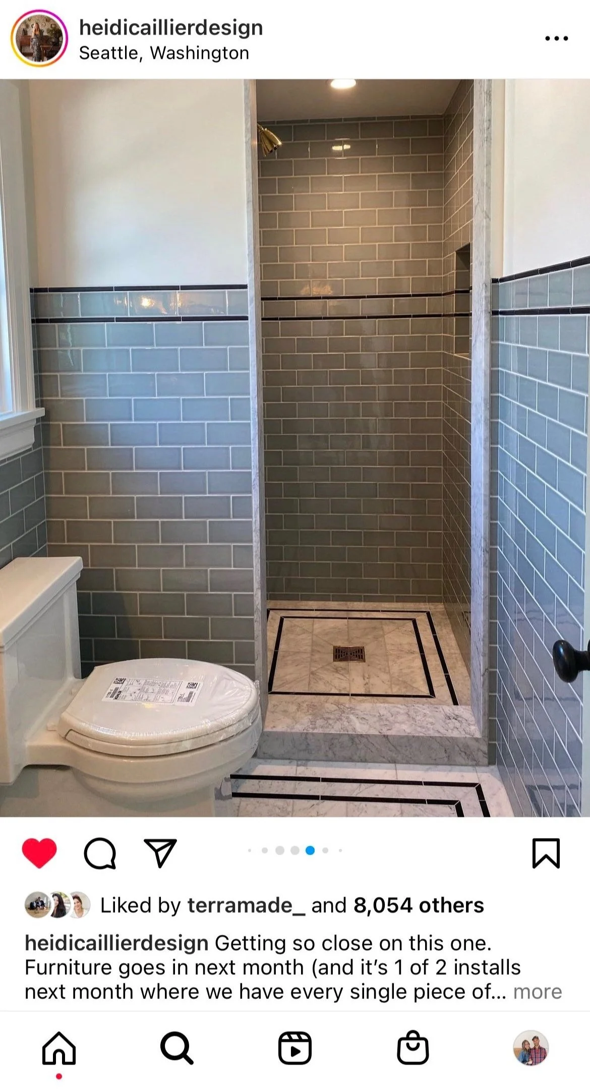
Subway is such a classic for the turn-of-the-century homes around us, and I love how Heidi Caillier swapped the color and added a pencil detail to freshen up the classic tiles.
And another screen shot from the Misfit House. I love how she mixed shapes and tiles in a similar color way here. It has that could-have-been-here-forever feel, yet also feels totally fresh and new.
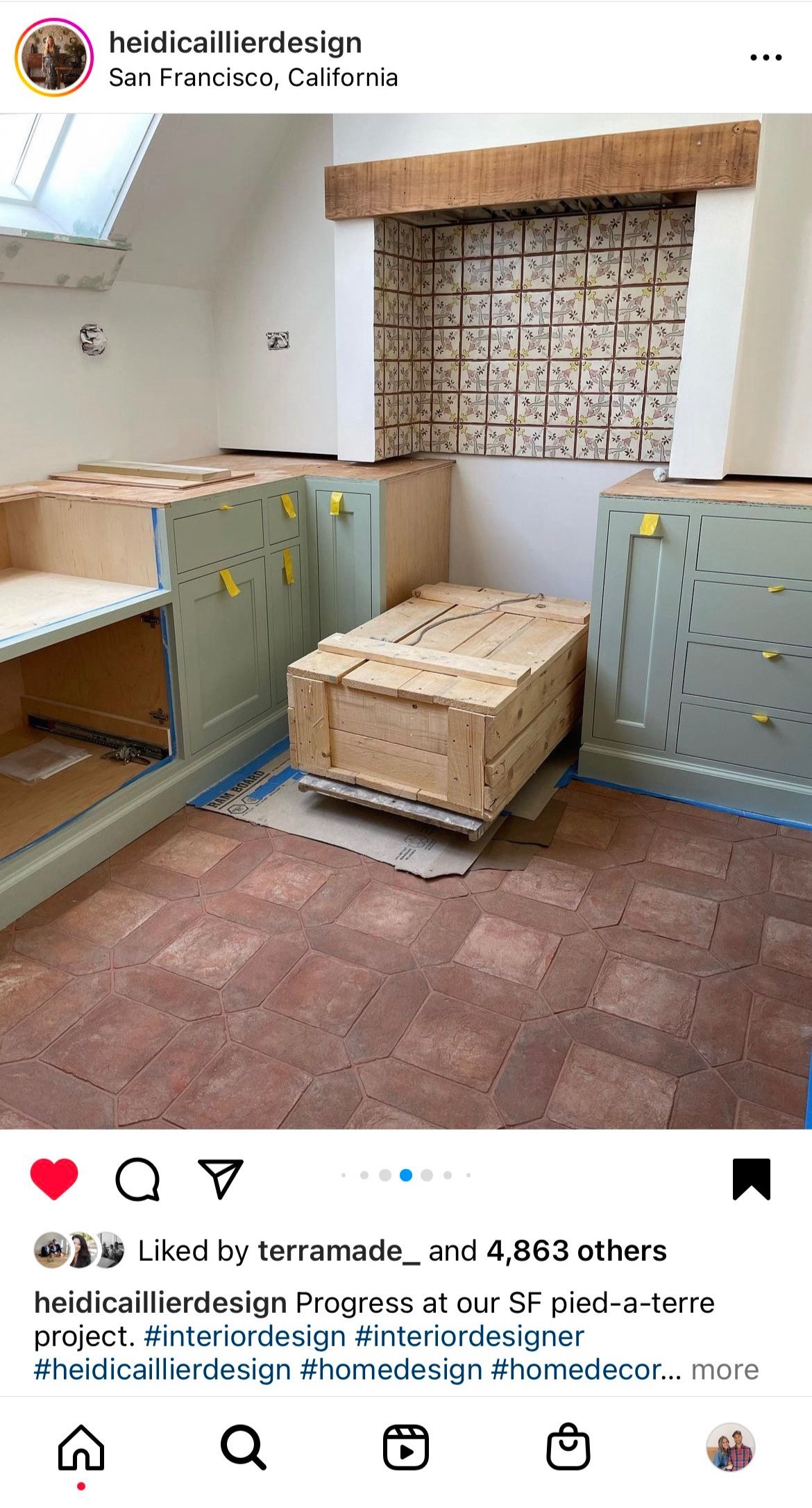
And another from Heidi Caillier. These floor tiles are STUNNERS and very old-world, but they also feel exciting and fresh, at least to me.
Here are some more square/rectangle geometric patterns. The first is from Stephanie Sabbe (another amazing designer) and feels oh-so-doable to lay.
Stephanie Sabbe via Studio McGee
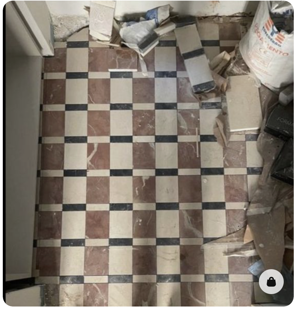
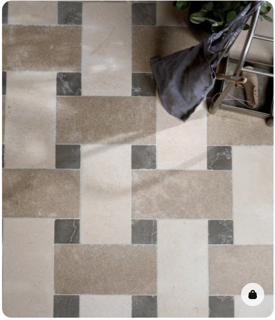
These next two patterns, both found on Pinterest (original source unknown), are both so beautiful and unexpected. The patterns feel totally classic and would be relatively easy to lay, but I haven’t seen them before.
found on Pinterest
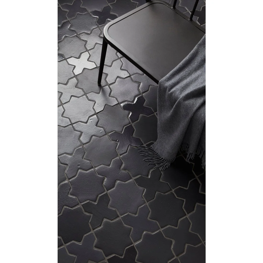
This last pattern - a cross and star - is a long-time favorite of mine. I love the charcoal handmade variety the Tile Shop has right now and it would look really beautiful in Terracotta too.
Lots of inspiration, and that’s just the tip of the ice berg! Now if I can just make some decisions…

