The Farmhouse // Kitchen Floor Plan 2.0
THE FARMHOUSE
You guys gave us so much great feedback on January’s floor plan post, that Garrett and I have spent the past month reworking our kitchen layout. We are so grateful for your thoughtful comments and the time and energy you put into it. Our future kitchen thanks you! Today I’m sharing two of our favorite kitchen floor plans. And if you’re just joining this conversation, you can get caught up HERE.
But before I show you our favorite floor plans, I wanted to share one inspiration photo for the space.
design and photo: @simpleofferings
Heidi’s home is gorgeous, and her kitchen is no exception. I love the light and airy feel of this space and the classic finishes. We’ll be using some of the same details: neutral cabinets, farmhouse-style sink, marble countertops, lots of windows, and brass hardware.
Now about those floor plans…
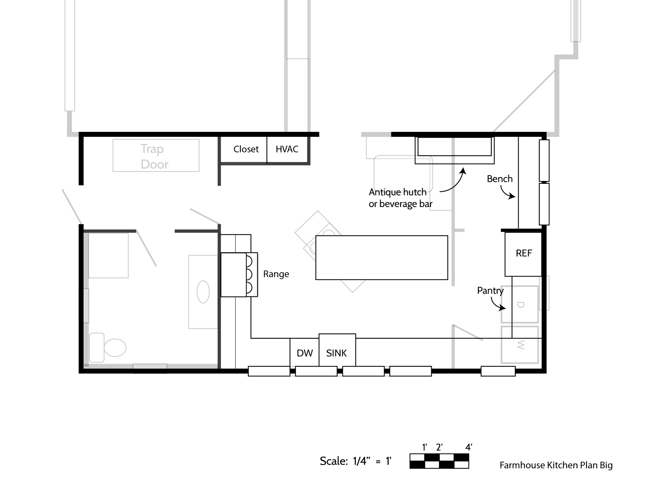
Option 1 - big kitchen
You can download this plan HERE (we love feedback!).
I’m going to start by saying this is our favorite option. And assuming we have the wherewithal and budget to take on this bigger renovation, our kitchen will end up looking similar to this.
Option 1 is similar to the floor plan you saw last month but incorporates a few big reworks. We removed the desk since 95% of people say they’re junk collectors (glad we dodged that bullet!). We also left off the new outside door, after coming to the realization that we probably wouldn’t use it much. Plus, as one commenter mentioned, we don’t have room designated for another backdoor landing spot. So we replaced those elements with some storage and a hangout space (currently shown as ‘bench’). We’re hoping the later addition will provide a spot for the kids to hang out, read, and be nearby without being under foot.
This plan shows the range on the opposite side of the kitchen, a change you’ll see in the next option, too. A lot of you suggested this arrangement and we liked that it would allow us to use the existing cabinetry, both uppers and lowers, without rearranging them, which should save a lot of time and effort on this renovation. The trade off is that we can only accommodate 36” range, but I’m sure that will be adequate.
Probably my biggest concern for this layout is the distance between the fridge, range, and sink (the ‘kitchen triangle’). But it’s difficult to decrease that without moving the fridge into the walkway or removing a window, neither of which we want to do. I’m also not a big fan of appliances in islands (at least not for how we work in the kitchen). So this is the best placement we could come up with…and I think it feels pretty good. Here are the pros and cons for this layout:
Pros
Bigger kitchen
Additional seating
Cons
Removing the wall means more work and money
We’ll have to find another spot for the laundry
Option 2 - working within the existing walls
You can download this plan HERE.
I introduced this option on Instagram a few weeks ago in an effort to make this renovation easier on ourselves by not removing the wall. So this option is the less-work, less-money choice and boasts a walk-in pantry. But it also has less seating and square footage overall. It’s just not the bright and large kitchen we were hoping for. Also, the fridge is in the pantry. I know many people won’t like that idea, so we have thought about swinging it around into the kitchen (and recessing it into the pantry), which is an option, but would partly defeat the whole “working with what’s here” plan. Of course we want to be able to sell this house someday (should we want to) and don’t want the fridge-in-the-pantry to ward off potential buyers.
Another thing I like about this plan is that the laundry is on the first floor next to an exterior door. It makes it easy to take laundry outside and hang it on the lines. Here are the pros and cons we see with this plan:
Pros
This plan works within the existing space
Less time/effort/money
Laundry placement is ideal
Cons
Smaller kitchen
Less seating
The fridge is in the pantry
Those are the two plans we’re considering at the moment. Of course I titled this post “Kitchen Floor Plan 2.0”, knowing that things will likely change some both before and during construction. That’s just the nature of old homes. But we’d love to hear your feedback. Are you a fan of one floor plan more than the other? Is there something you would absolutely change?


