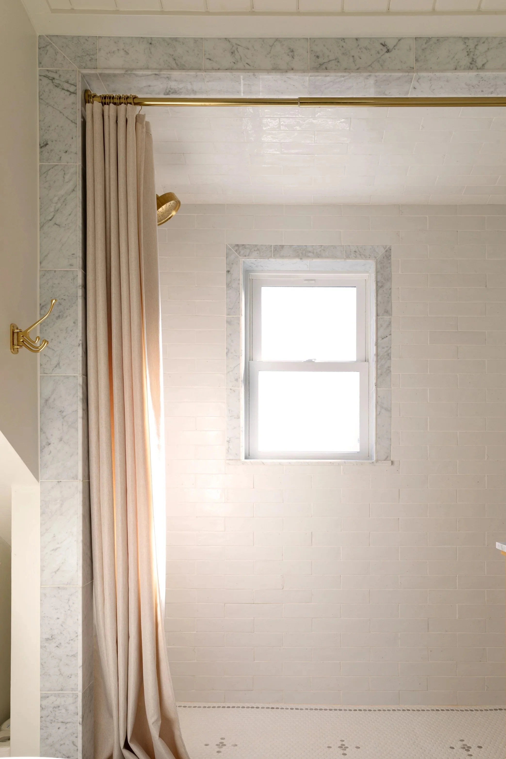
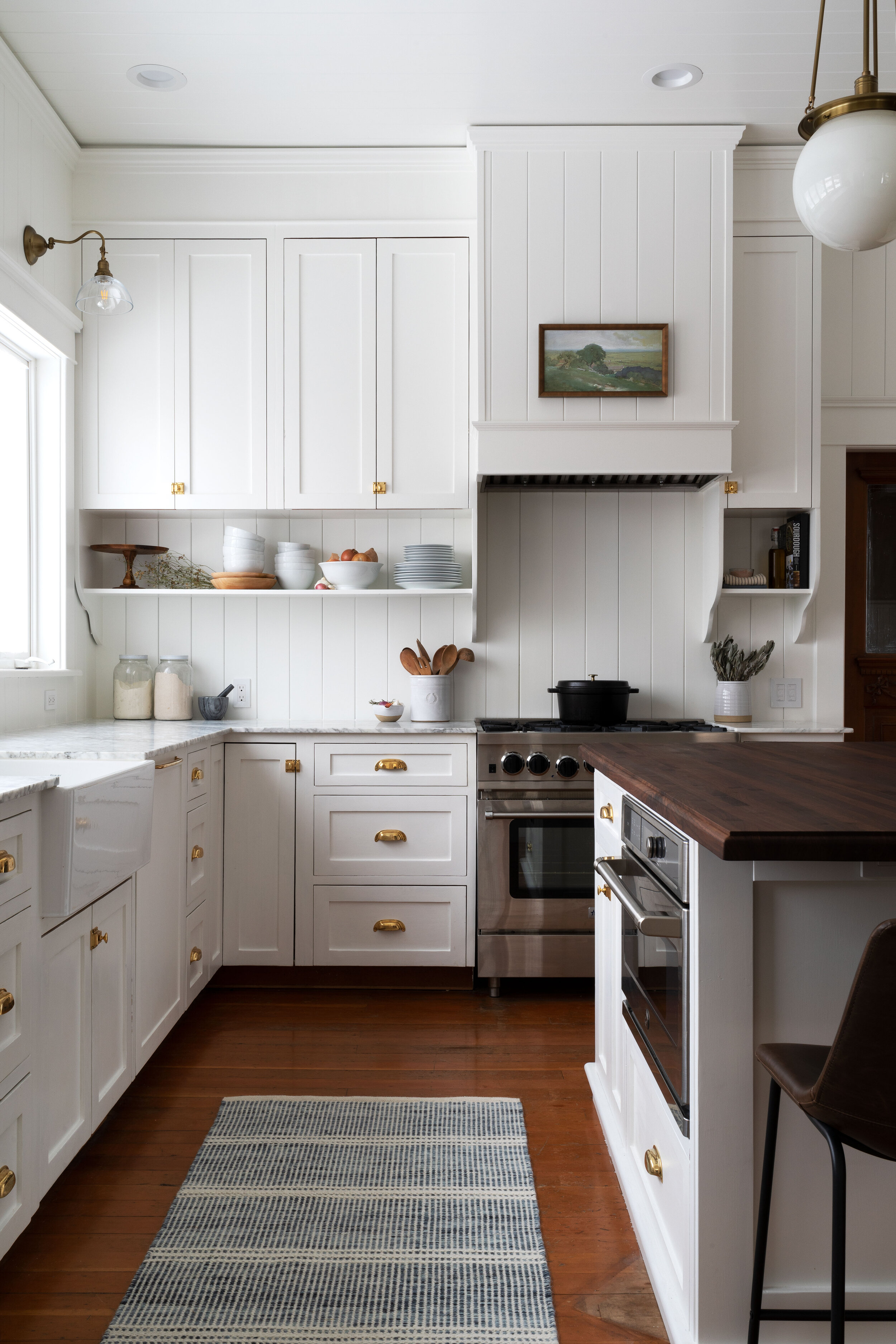
A Whimsical and Classic Kids Bathroom
THE FARMHOUSE
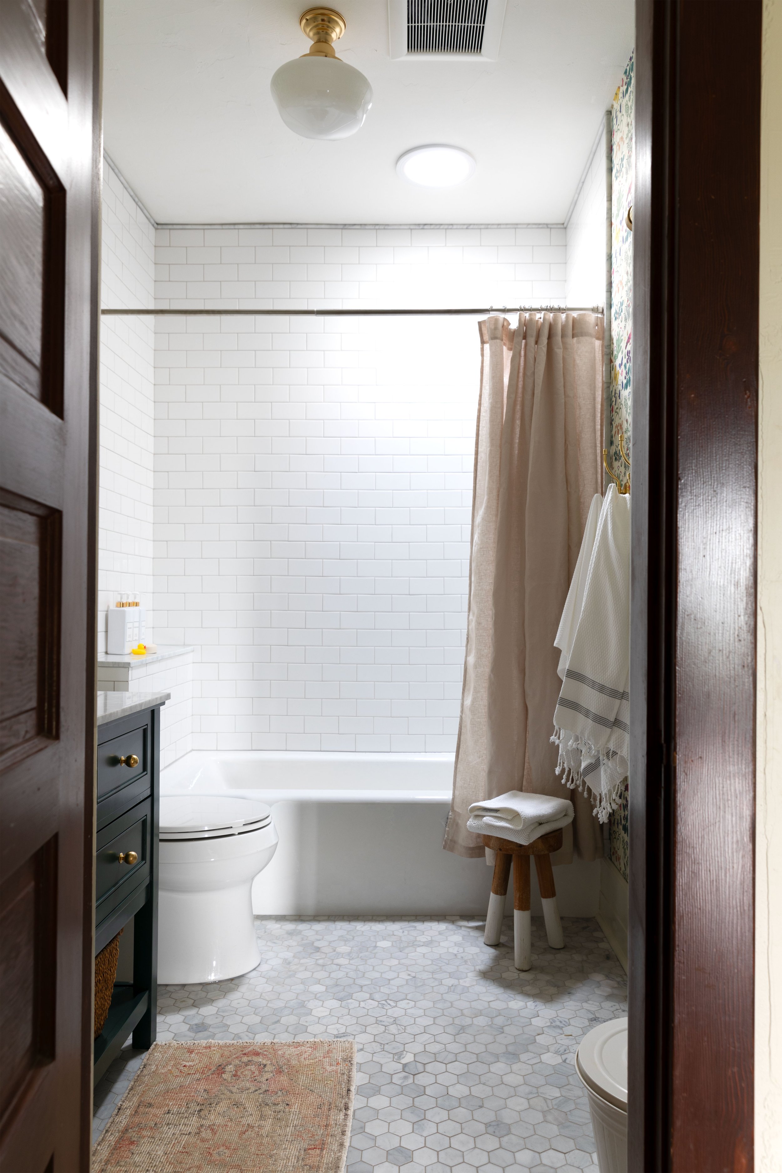
The kids bathroom is finished! This space is whimsical and classic and just so FUN! Today I have a reveal post for you chock full of photos, sources, and all the details on this crafted and colorful bathroom. We’re so pleased with how it turned out and grateful for all your encouragement along the way!
sources at the bottom of this post
psst: get caught on on revious posts: kicking off the kids bathroom, tile and wallpaper, how to color match wallpaper, adding custom marble details.
This bathroom came together pretty quickly for us…just about 3 months. That’s about 10 months less than our last bathroom project ;) In actuality this was a pretty major remodel - basically a gut job with almost every plumbing fixture moved - but upfront planning and a clear design plan really shrunk the timeline! Yay for progress :)
Before I share more, here’s what the bathroom looked like before…
Not a bad space…but awkward! I’m pretty sure this bathroom was originally a closet back when the house was built in 1912. A 4’-wide, it was hard to get more than one kid in the space at any given time.
Our main goal with the renovation was to widen the bathroom, taking space from the primary bathroom that we had set aside during that renovation. The kids bathroom went from a narrow 4’ x 8’ to a roomy 6’6” x 8’. (All three kids can be in here at the same time now!) Other goals for this space were adding a tub (an essential in a kids’ bathroom IMO) and brining in fun and classic details.
I’m pretty obsessed with this tub, it’s solid cast iron and oversized. Of course solid cast iron means the tub weighs 400lbs and moving that sucker up two flights of stairs (with just Garrett, me, our 10-year-old, and some pulleys!) was a feat of patience and strength. But 100% worth it!
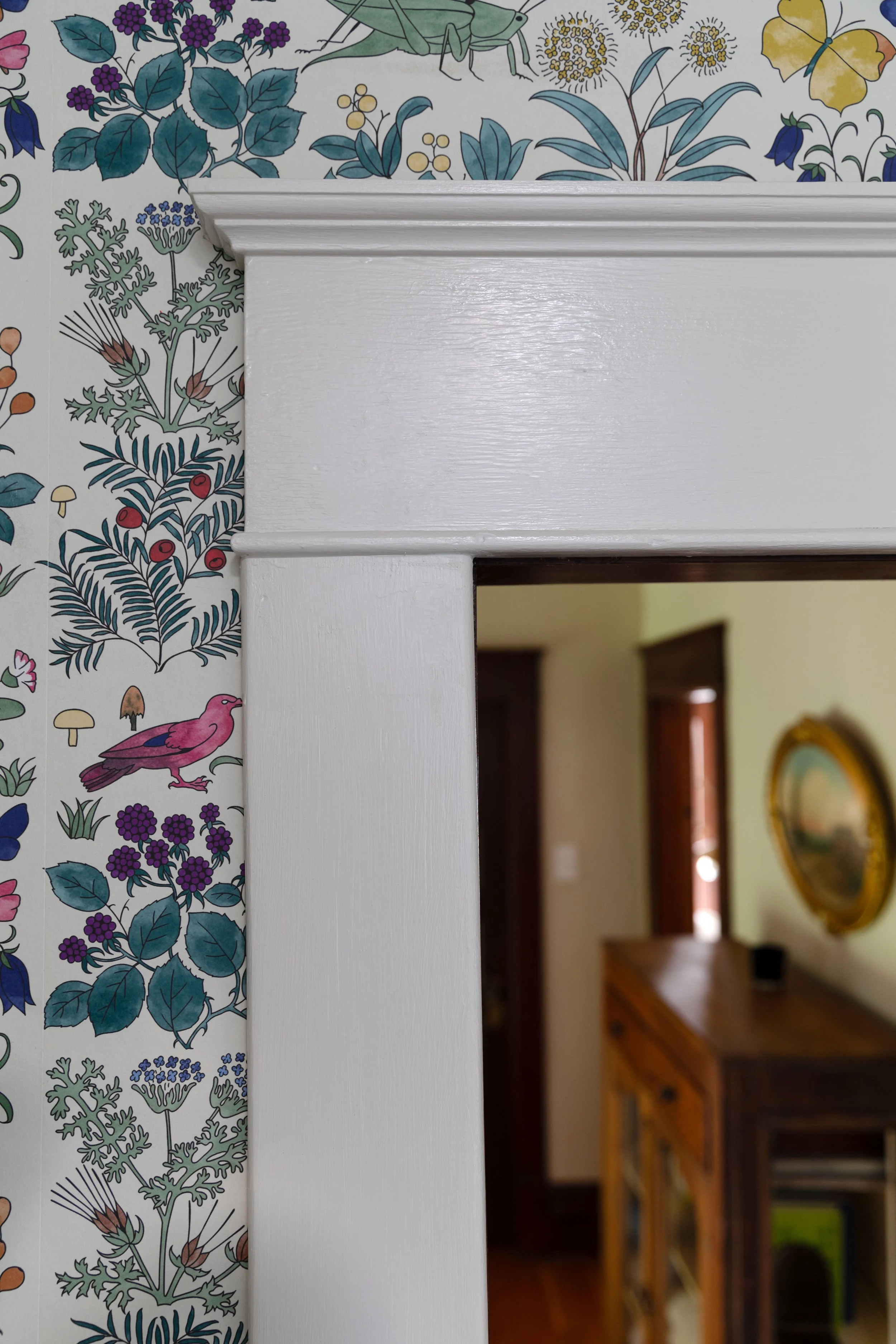
For the design of this bathroom, we went with a classic, fun look. Classic as in the space feels like it belongs in a 1912 foursquare-style Farmhouse. And fun as in whimsical, vintage wallpaper by CFA Voysey with colorful flora and fauna. I could stare at this paper all day long! We kept the other finishes pretty simple and classic so as not to compete with the paper.
We kept the tilework really simple in here, opting for white subway on the walls and marble hex on the floors. It’s really similar to the design we used in the primary bathroom. I love repeating bathroom finishes in a house - it feels really ‘old home’ to me.
Garrett cut all the marble in here, even adding curved cutouts to the backsplash and sidesplash. They lend a crafted feel to the space and break up all the straight lines.
One tricky part of this bathroom reno was picking the trim paint color. I had originally planed on a green color to match the wallpaper. But once I had painted all the trim in BM Cedar Grove, it just felt like too much with the darker green vanity. So I pulled out a can of cream paint that I had had Benjamin Moore custom match to the lockers in our mudroom and painted all the trim again. By some miracle it was perfect!
Here’s the formula for our mudroom lockers cream color for anyone who wants it…
There’s barely any natural light in this bathroom, just a small sky light, so giving the space adequate lighting was really important. We found all of the light fixtures in here at Rejuvenation. We’ve been using their fixtures in our remodels for a decade now and love the quality, details, and longevity of their pieces. Plus they’re a PNW company :)
Sources
Here are some of the products we included in this bathroom…
sconces (aged brass, opal dome)*
shower curtain liner + linen curtain
Vintage rug from this shop
*denotes products provided gratis
I’ll leave you with a look at the second-floor landing. The camera is in Daphne’s bedroom and you can see across the hall to the kids bathroom and the boys bedroom (the primary bedroom is to the left of the frame). Pretty conveniently placed bathroom if I do say so myself :)
That’s the kids bathroom. We’ve been using this space for a couple weeks now and it’s been a real joy :)


