Picking a Cabinet Paint Color for the Poplar Cottage Kitchen
THE POPLAR COTTAGE
Slowly but surely, the design for the Poplar Cottage kitchen has come together. Originally I was planning a simple and heavy-on-the-white color palette (like I typically do! ; ), but the farther we’ve moved through construction, the more I’ve realized this cottage is calling out for some color, pattern, and fun! All of course, in a bit of a subdued, ‘Grit and Polish’ kind of palette and still with plenty of white ;) So today I wanted to talk cabinet colors for the Poplar kitchen…
sconces, hood vent DIY, shirt, boots
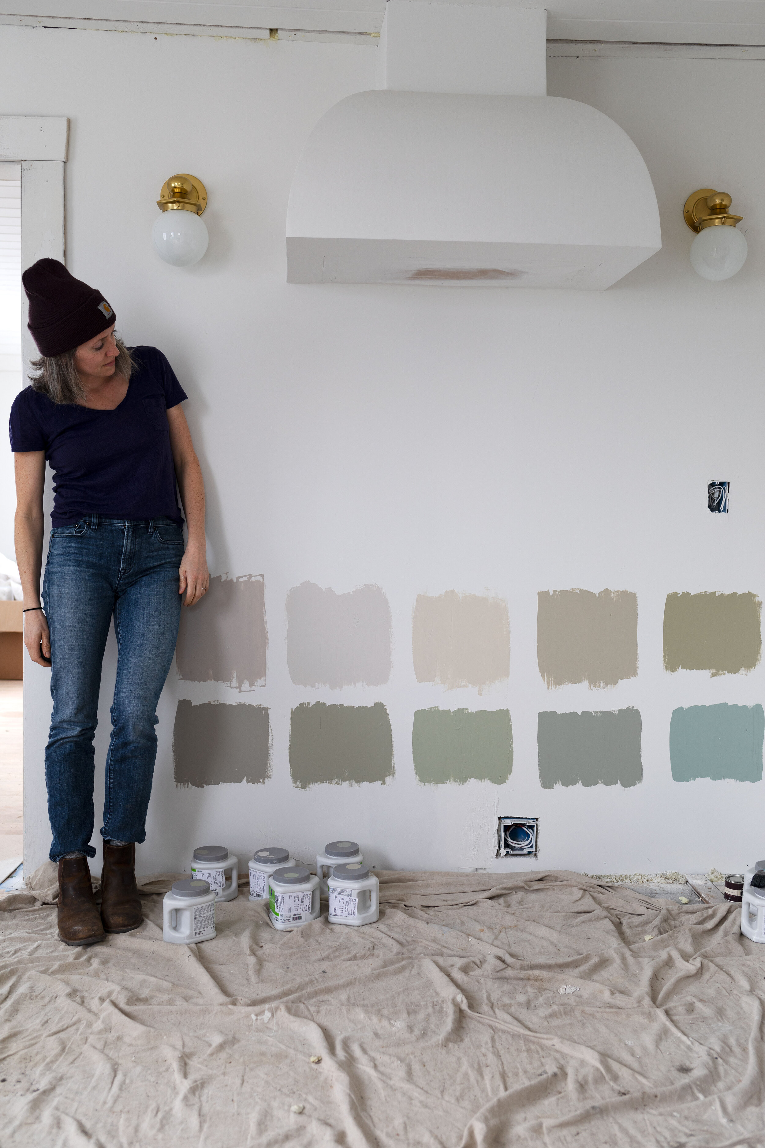
That’s a lot of color samples on the wall! Honestly, I dread picking colors (why is it SO hard?!). So I turned to my Farrow and Ball colour card because I’ve always been a fan of their colors and I’m even a bigger fan of their limited options (!!!). So I picked out some neutrals and greens went down to our local Sherwin Williams store and had them match the colors in sample sizes. Oh and I threw in the green blue sample at the last minute for kicks.
You might be asking ‘why all these neutrals when you said you want more color?’ And here’s the thing: neutral is my form of color. Ha! But really it is. Plus the Poplar Cottage is tiny and the kitchen opens onto 3 different rooms and I worry that too much color here will preclude me from using color in those rooms. That might just be my I-usually-paint-everything-white-self talking, but the adjacent rooms are definitely a consideration for this cabinet color.
psst: you can see all of the white paint colors we sampled here
Sample colors:
top: FB elephant’s breath, FB skimming stone, FB off-white, FB bone, FB ball green, FB pigeon
bottom: SW gateway gray, FB French gray, FB vert de terre, FB blue gray, FB green blue, BM Swiss coffee
So what am I looking for in a cabinet color? Well something that excites me and feels different than the white we have at our Farmhouse. And something that doesn’t make this small kitchen look even smaller. And also something that goes nicely with white oak, brass, BM simply white (which is on the ceilings), BM Swiss coffee (I’m still debating using this on the walls), our quartz countertops, and stainless steel appliances.
I should mention that the Poplar Cottage is also a really fun opportunity for me to experiment with design and try things I want to do, but can’t/won’t/don’t do in our own home. For some reason trying things in our own home is a whole lot harder than trying things in a rental property. For instance, I love wallpaper, but can’t seem to pick a pattern for our own home to save my life. Because I’ll see that wallpaper pattern every day for the next 50 years and what if it’s not classic enough to last and what if my tastes change and what if Daphne draws on it with a Sharpie and what if I decide I hate wallpaper in 10 years? But in a home I am not planning to live in, well picking a wallpaper pattern seems a whole lot more do-able. Take that for what you will.
Here are the color samples next to our quartz countertop for reference:
After staring at these samples for a week, two colors popped out at me: bone (top row, 4th from left) and blue green (bottom row, 5th from left). I FaceTimed my sister for her opinion, asked Garrett, and they reaffirmed the choices (although Garrett liked the green blue better and my sis liked the bone better).
Bone is a nice rich neutral and reads a little green in certain light. And green blue was a wild card but gosh dang it, it just looks so pretty and cottage-ey on the wall.
Sample colors:
top: FB elephant’s breath, FB skimming stone, FB off-white, FB bone, FB ball green, FB pigeon
bottom: SW gateway gray, FB French gray, FB vert de terre, FB blue gray, FB green blue, BM Swiss coffee
So what do you like? Does Bone or Green Blue call to you? We picked up our cabinets last weekend in Seattle and can’t wait to get some paint on them!
UPDATE: You can see which cabinet color we ended up picking here.


