Home Tour // A Charming Seattle Carriage House That Proves Bigger Isn't Always Better
At just 1200sf and outfitted with a galley kitchen, today’s home tour is quintessential ‘old house’. Charming, quirky, and little all describe this 1915 carriage house in Seattle’s Capital Hill neighborhood. When I saw pictures of the home on designer Heidi Caillier’s Instagram, I knew I wanted to share it here on the blog. A lot of us have been in a home like this one, and had no idea quite how amazing it could be. I mean I’m basically dreaming of a galley kitchen now! I hope you enjoy this home tour as much as I do.
Photos by Haris Kenjar, shared with permission by Heidi Caillier Design
The owners had “long toyed with the idea of upgrading to bigger quarters, but decided to sacrifice space for charm,” Caillier told Remodelista. So they hired Caillier to update the “very lived in and loved” interior. Caillier excels with color and old kitchens, both of which are featured here.
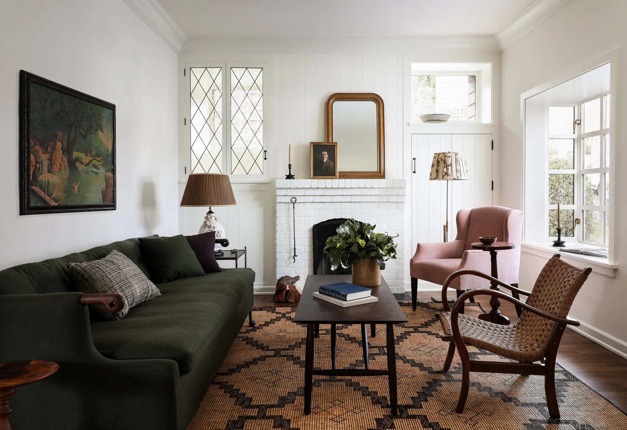
Let’s start in the living room, which has the most beautiful windows and cozy flow. And the furnishings and decor feel as if they’ve been collected over time.
The room feels so inviting and interesting without being overdone. Understated might even be a better word. There are no throw pillows or window shades and minimal rugs and art. I’m a big fan.
Moving into the dining room, there’s a classic archway - a feature they reproduced elsewhere in the remodel to open up spaces without opening them up too much. I love the beautiful, unfussy pendent over the dining table.
My favorite feature in this room is the curved built-in, which is actually a new addition to the space. ”It mimics what was in the living room,” Caillier told Remodelista.
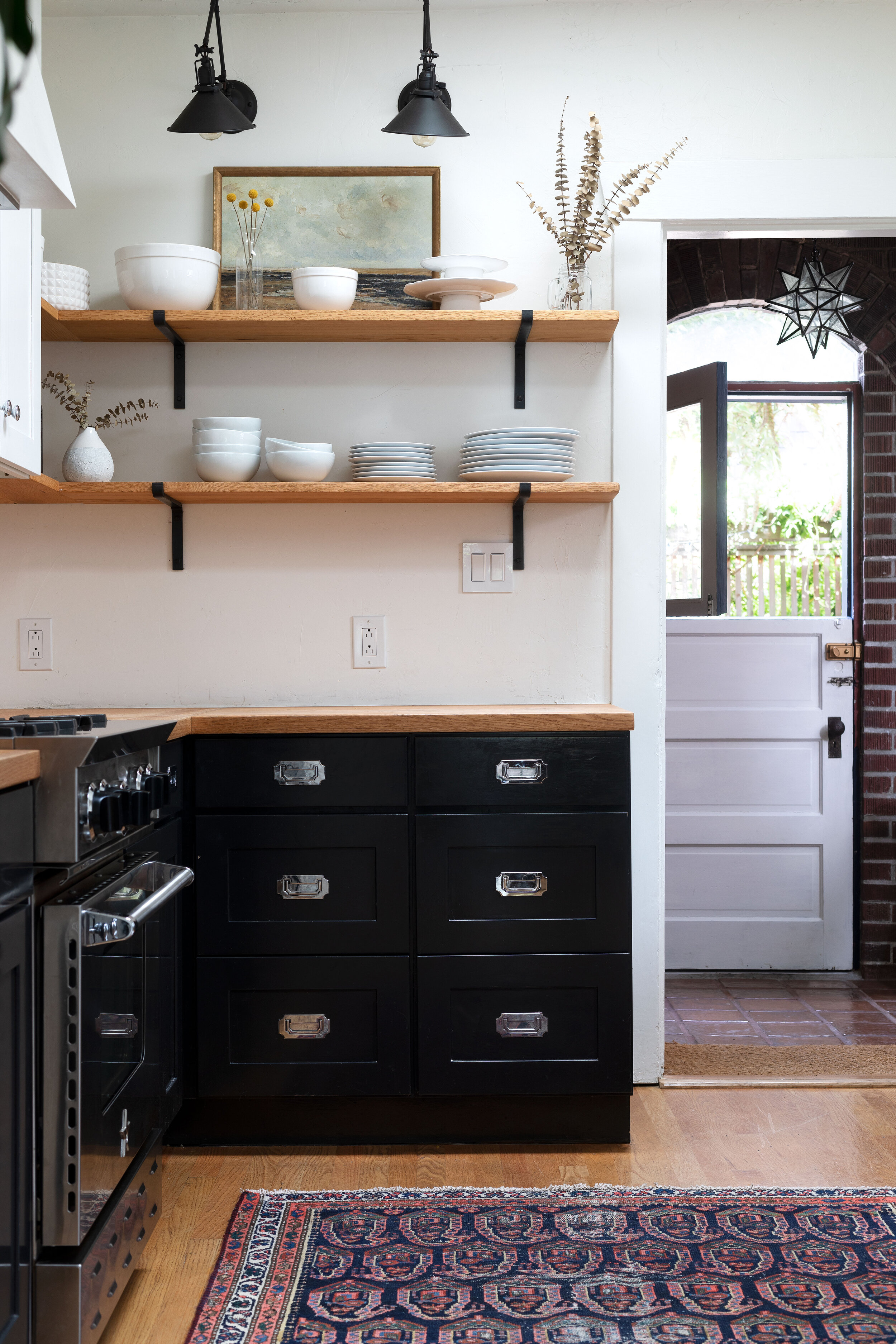
Another archway brings us to the kitchen. Galley kitchens have gotten a bad rap in recent years, but this one is done so well. It’s cozy and well-appointed and just the right amount of open-ness to the living spaces. The perfect antidote to the giant open kitchens of today.
The routered edge on the walnut butcher block is a beautiful detail (we DIY’d something similar in our Farmhouse kitchen). The lovely green color is Farrow & Ball’s French Grey. And you know I love that brass hardware. To tie this kitchen remodel in with the rest of the house, Caillier brought in the same crown molding profile and new windows replicating the leaded-glass detailing from the old windows.
Caillier says designing galley kitchens, “can be tricky. You have to add nooks and crannies or they can feel boring and sparse. I don’t always like open shelves in the kitchen, but this client has wonderful accessories, so I knew they’d work here,” she told Remodelista.
And now for the most unexpected little bathroom that has stollen my heart (and made me consider painting every room in our house pink). The color is Farrow & Ball’s Setting Plaster.
I love the curved vanity that nods to the original built-ins in the living room. Lovely, right?!
You can see more of Caillier’s work on her website (her portfolio is AMAZING!) and Instagram page. Thanks for sharing this project with us, Heidi!


