Home Tour // This Spanish Art Deco Remodel Strikes the Perfect Balance of Modern and Traditional
I recently discovered self-taught interior designer Katie Hodges and fell in love. (I know, what rock have I been under? Her work blends effortless California style with crafted details. She mixes modern with traditional. And her spaces always always feels approachable.
When I saw the vintage Spanish Art Deco remodel she recently designed in LA, I immediacy reached out and asked if I could share the home here on the blog. Because it is a white-paint-lover’s dream! The nooks and built-ins are EVERYTHING. I hope you love our February home tour as much as I do!
Photos by Haris Kenjar, tour shared with permission by designer Katie Hodges, originally seen on marthastewart.com
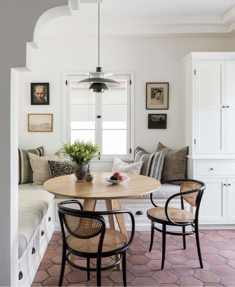
This dining nook is my favorite moment in the home. Isn’t it lovely?! It was designed for morning coffee and curling up with a book, Hodges told marthastewart.com. And the chairs were a great find on Etsy.
The windows and moldings throughout the home are phenomenal. There’s really not another word for them. They give the home a heavy dose of old character and vintage charm. And I love how Hodges tempered the architectural elements with all-white walls and modern lighting. It helps the home feel accessible and relevant to 2020.
Nook number 2 is just as good as the first. I’d love to curl up with a book right here or doze off for a Sunday afternoon nap. And you guys know how much I love white walls, but Hodges takes it up a notch with layers, texture, and more layers.
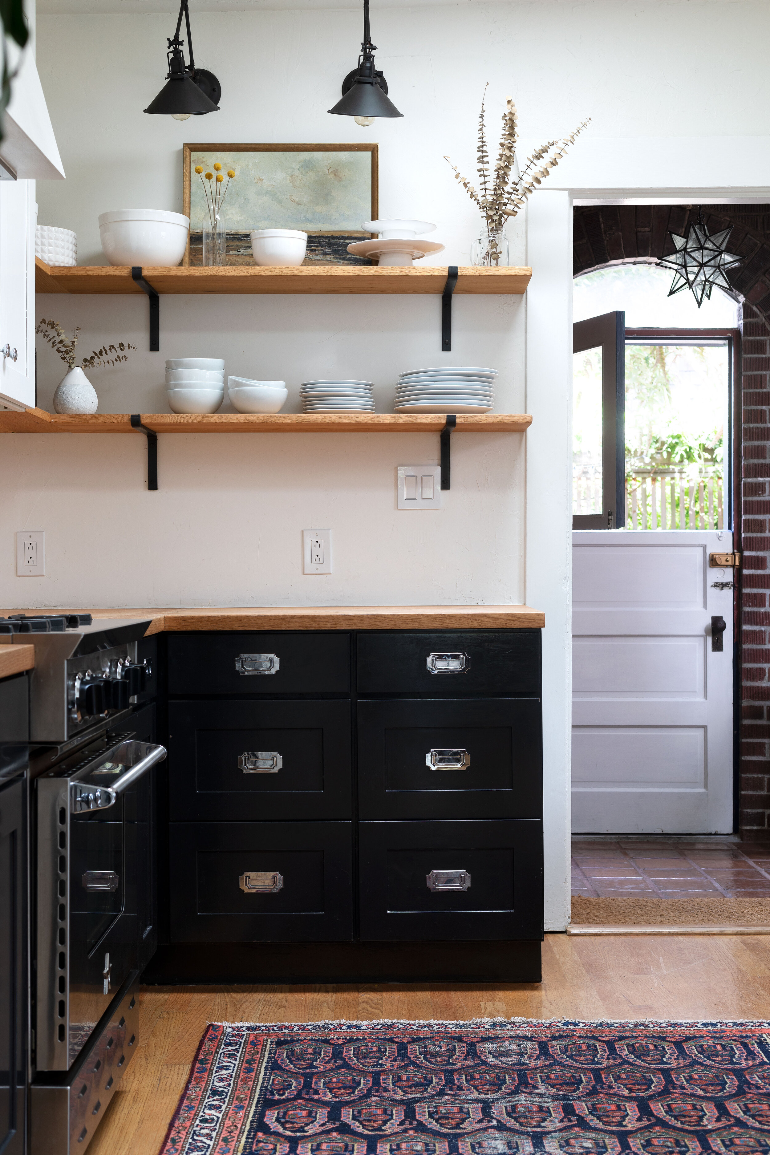
The kitchen is an addition, although you probably wouldn’t guess it. Hodges designed the cabinets to have traditional details that would blend in with the home. And the terra-cotta floors give a nod to the Spanish architectural style of the home. I also love that the windows look to be perfectly matched with the lovely casement windows in the original parts of the home.
Hodege’s website explains her design style as: “Deeply rooted in her love for California’s architecture and lifestyle…Katie’s designs are intelligently layered, striking a balance between modern and traditional, while maintaining accessibility that never feels overly-designed or precious.”
Can we talk about this built-in for a sec? It might just be my favorite closet…OF ALL TIME! It’s functional, simple, and bursting with character. Taking notes on this one and you better believe I sent it to Garrett!
Thank you Katie for letting us share your work here on the blog.
And can find more of her work on www.katiehodgesdesign.com and on Instagram (and you better believe you’ll find more perfect nooks if you follow those links!).


