Dreaming of Wallpaper in the Dining Room + Our New (Old) Piano
THE FARMHOUSE
We recently brought home a piano to the Farmhouse (!!!). And as we slid it into place against the dining room wall, I started thinking about all of our dreams for this room. We use this space every single day (mostly for things besides dining - ha!) but have yet to touch it besides bringing in old furniture. So today I wanted to share some photos of the dining room, the story of how this piano came to be here, and show you a few design ideas I’m pondering for this space (hint, hint: wallpaper!). We likely won’t be working on this room any time soon, but that doesn’t mean we aren’t thinking about it! Design can take years (and years…and years 😉) to come together…at least it can for me. Let’s get into it…
Our new (old) piano
Some years ago a friend of ours saw a listing for a free piano on her neighborhood’s website. A good piano in good condition that maybe needed a little tuning. You haul, the ad said. Free was too good of a price to pass up so our friend told the seller that she’d be by that night to pick it up…despite not having space to house the piano. Now this friend is a we’ve-known-her-since-college, been-through-times-together, is-the-godmother-of-our-daughter type of friend so when she asked Garrett to help move the piano, he said you bet and offered the Bryant House basement (where we were living at the time) to store it.
Moving a piano is no joke. Have you done it before? Eek. I was pregnant at the time so got a free pass, but our friend, her husband, Garrett, Garrett’s dad, and another friend or two (if I recall correctly) went over to the seller’s house, rolled the piano out of their basement, up their driveway, lifted it onto the back of a truck, and drove it over to the Bryant House. Then they backed into our parking pad, offload the piano, rolled it down the grass hill to the backyard and pushed it into the unfinished daylight basement. By the end of the night, they all vowed never to move a piano again. Or maybe just one more time if someone found a good spot for it.
Fast forward 7 plus years and the piano was still sitting in the Bryant basement (which was now a rental) collecting dust. At this point our co-ownership had turned into a common-law-marriage-type situation and was mostly just our’s. We thought it might sit in the basement forever, but I’m happy to report it didn’t. At the end of May, Garrett and his dad brought it home to the Farmhouse.
If you’re wondering why now?, there’s a few reasons. Our oldest son takes piano lessons (Zoom lessons now) and he used to practice at Nana’s house right by school, but once we got ‘stay at home orders’ that stopped. Garrett and I also cemented our residence at the Farmhouse this Spring, so we felt confident that moving the piano here would be that one more time.
We had tenants turning over at the Bryant House in June, so Garrett and his dad seized the opportunity to pick the piano up (another less-than-easy feat). After driving it home, Garrett built a temporary ramp between the trailer and our front porch and we were able to get it into the Farmhouse with little fanfare. The piano is a little scratched up, but considering all the moves and how old she is (1930s?), I’d say she’s in pretty good condition. And goodness, it sure is fun to hear music in the house!
our dining room, currently
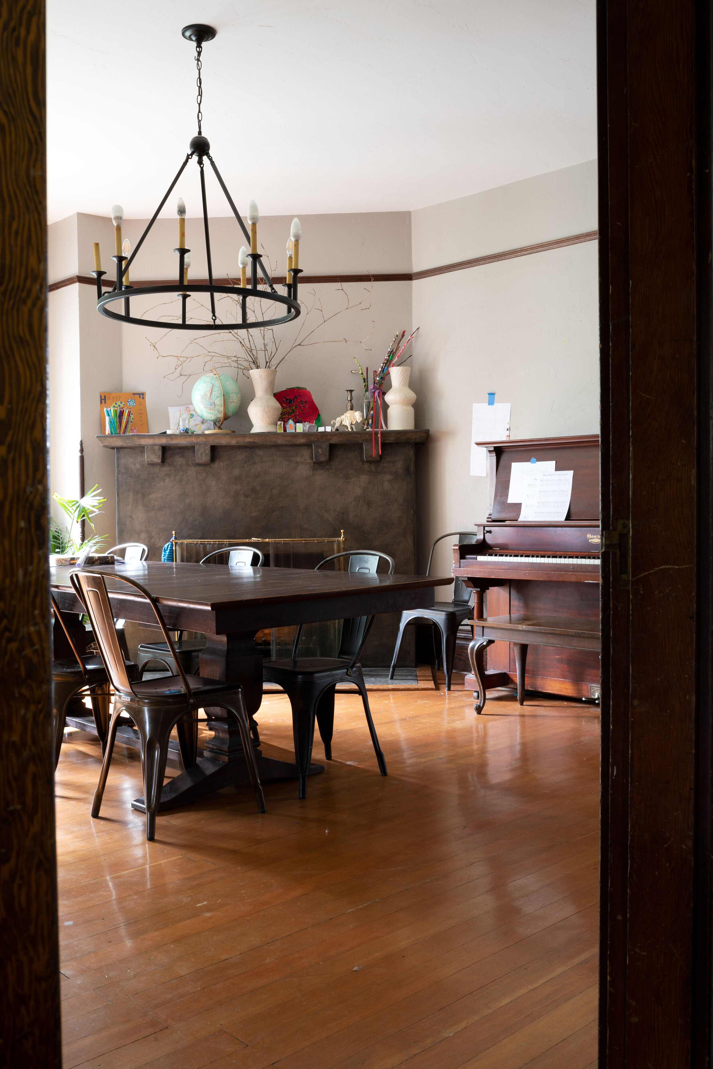
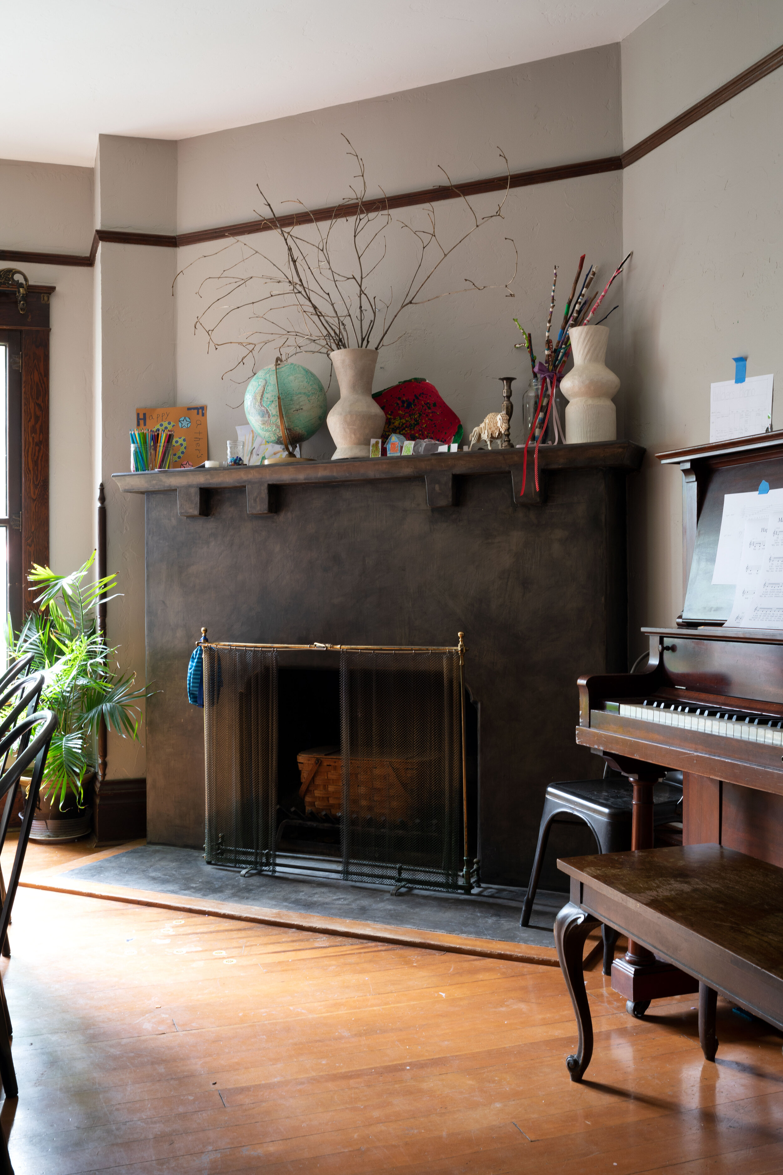
Right now our dining room functions mostly as a craft space, distance learning spot, and now music room rather than an actual dining room. We eat in here occasionally - at holidays or when we have guests over and then only when it’s too cold or windy to eat in the garden - but mostly it’s those other things. Our dining room is a pass-through space that leads from the entry and living room to the kitchen, so we’re in and out of here all day, every day. If you’re curious what our floorpan looks like, you can find it here.
Let’s have a look around the dining room…
There you have it. Our dining room is certainly not a design masterpiece, but it’s well-used and full of potential.
Design thoughts for the future
Garrett and I have long considered this room an ‘evening room’. With west-facing windows and zero morning light it’s best enjoyed in the later half of the day. So over the years we’ve thought of decorating it as a cozy space, rather than the light-and-bright-white-farmhouse vibe we have elsewhere in the house. We’ve imagined wood panelling, dark paint colors, or wallpaper on the walls. And we’re itching to remove the cement from the fireplace (which was reportedly originally covered with handmade Italian tiles). We’d also like to add more lighting and swap out the chandelier. Maybe a built-in banquette below the casement windows? There are more immediate plans to move the homeschooling space out of here. And surely other furniture will change too, but I haven’t gotten that far.
The design element I am dreaming about right now is wallpaper…
Should we wallpaper the dining room?
Now that we brought more dark wood into this space courtesy of the piano, I’m itching to do something to the walls. And I feel like wallpaper is the scratch. So today I thought it would be fun to do some mock-ups of prints I love. I always struggle with committing to a print (thus we hardly ever use wallpaper), but mocking them up gives me more confidence. psst: I used this photoshop tutorial to do these mock ups.
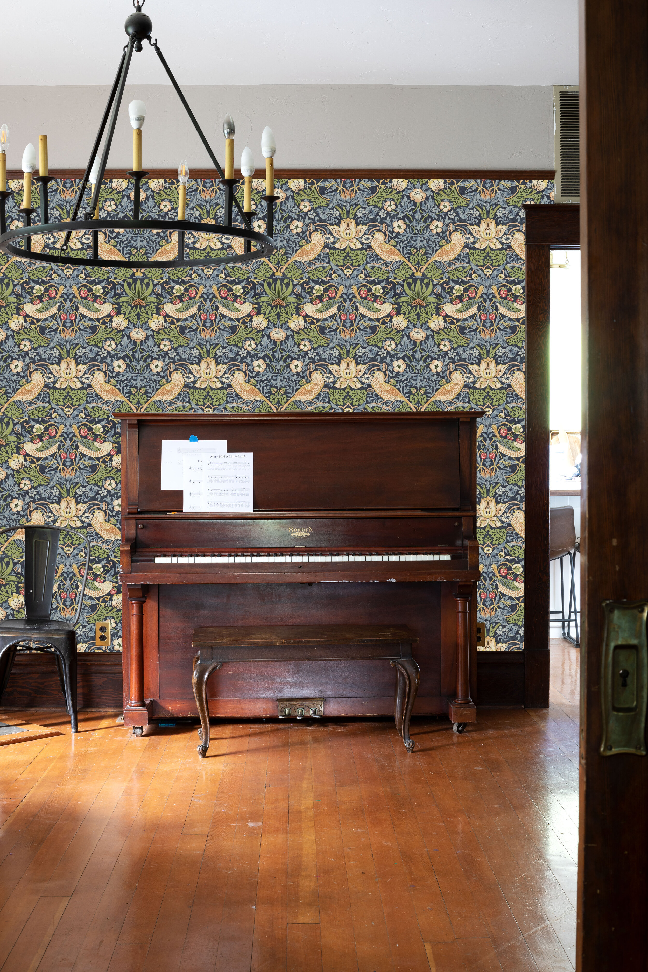
1 // Morris & Co - Strawberry Thief Wallpaper (available here)
A couple months ago my friend Ashley shared this Morris wallpaper and I thought it would look lovely in here. For those that don’t know, William Morris was a 19th century designer (among other things) in England and his prints are considered classics now and still popular.
A couple things you might be wondering - that’s not the exact scale of the wallpaper (my photoshop skills aren’t that good 😉). And we’d either wallpaper to the ceiling, underneath the picture rail. Or, more likely, wallpaper to the picture rail (as shown) and paint the wall above it white like the ceiling.
2 // Morris & Co - Pimpernel Wallpaper (available here)
Now that we’re talking Morris wallpaper, my all-time favorite print is Pimpernel. I’ve seen it in kitchens, bathrooms, living rooms and bedrooms and always loved it.
Isn’t it pretty?! I think it would read more saturated in real life, but either way, the colors would juxtapose our all-white kitchen nicely.
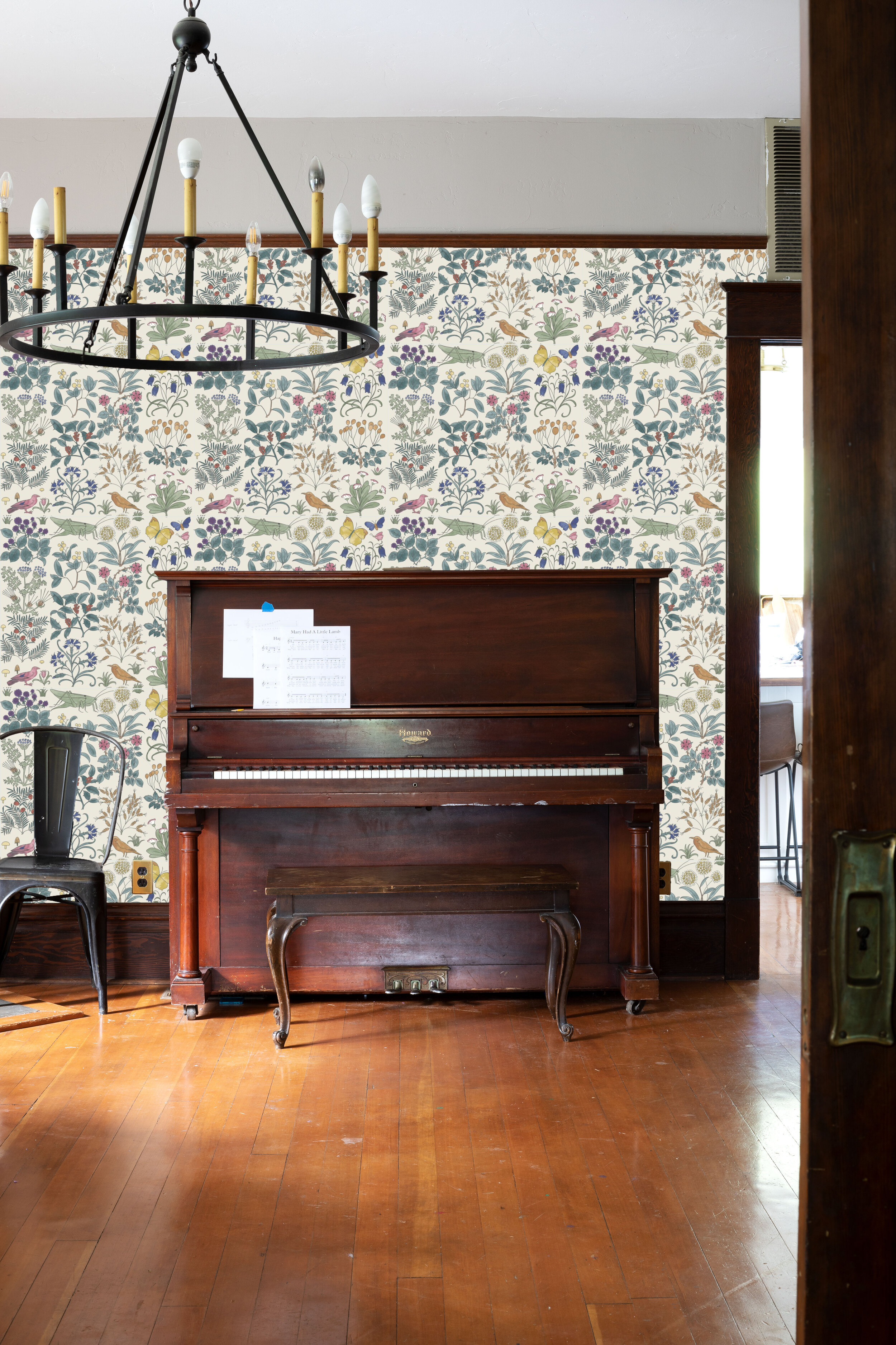
3 // C.F.A Voysey - Apothecary's Garden Wallpaper (available here)
Another favorite wallpaper is this Apothecary print. This was probably my first ‘love’ when it came to wallpaper, and that love is still going strong ten plus years later. Charles Voysey is another famous figure of 1800s English design (among other things) and his patterns are still popular.
Seeing it here, I don’t think this print is right for this dining room room. It’s a bit too youthful and not the cozy vibe we’re after, but goodness how lovely would it look in a bedroom? Actually it would be perfect in Daphne’s bedroom…
4 // C.F.A Voysey - Bird & Butterfly Wallpaper (available here)
The next print is new to me (I found it while scrolling through C.F.A Voysey’s prints at the website above) but it’s quickly rising up my favorites list. There’s a green/yellow colorway which I really like but is maybe too much with our brown trim and orangey floors. I hadn’t imagined blue in here, but now I’m not sure why not.
Isn’t it fun? But in a more-mature and cozier vibe than the last print.
5 // Cole & Sons Thistle Wallpaper (available here)
Last but not least, I’m including a floral print. This doesn’t have the storied history of the previous 4 prints, but my sister used a fabric version of this for curtains in her last house and so I have good memories of it. To me, this print feels old fashioned but also a bit modern (maybe from the colors?).
Seeing it here, this print doesn’t feel quite right for the space either. I think it’s lovely but just not the cozy, savor-a-long-dinner vibe we’re going for.
Which would you pick? I’m a fan of whimsical wallpaper prints, preferably with birds or flowers on them and all of these certainly fit that bill. Plus they’re classic prints that won’t go out of style, meaning I might actually be able to commit to one. Right now I’m leaning towards 2 and 4.
It sure is fun to dream and start picturing how this space could come together! And hopefully this post provided a little glimpse into our design process and the fact that homes take time…at least they do for us. This is going to be a fun space someday when it all comes together.


